Gett.UI
Design System
Tabby’s magic lives in its speed and simplicity. Loans, by their nature, introduce longer terms and more conditions. We faced a delicate balance: maintain the app’s effortless feel while giving a responsible, transparent loan experience.
The question wasn’t just where to put a new button, but how to make a fundamentally different product feel like a natural extension of Tabby.
Finance Design Lead
Andrei Khudiakov
Teams Involved
Business, Analytics, Dev, Research
Gett Inc.
Data Visualization. Interface.
2019 – 2022
Gett's Enterprise UI had become a collection of conflicting patterns. Five different teams used seven different date pickers. Accessibility was treated as an afterthought, with contrast ratios often overlooked. Documentation relied on tribal knowledge, where "Ask George" was not a scalable strategy.
The cost was real. Engineers kept rebuilding the same modals while designers repeatedly specified the same buttons.
Finding the Center
We began by listening. Engineers were tired of rebuilding the same modals. Designers were exhausted from specifying the same buttons again and again. The opportunity was clear: replace inconsistency with a system that accelerated work instead of adding bureaucracy.
The Inconsistency Tax
Feature development moved 40 percent slower due to redundant UI work. WCAG failures triggered last-minute refactors that derailed schedules. New hires faced confusion, constantly asking which version of which component they should use.
The Clear Opportunity
Stakeholders agreed that scaling required standards. Our challenge was proving a design system could actually speed up work without adding bureaucracy, and preserve flexibility without stifling innovation.
Starting With
Universal Needs
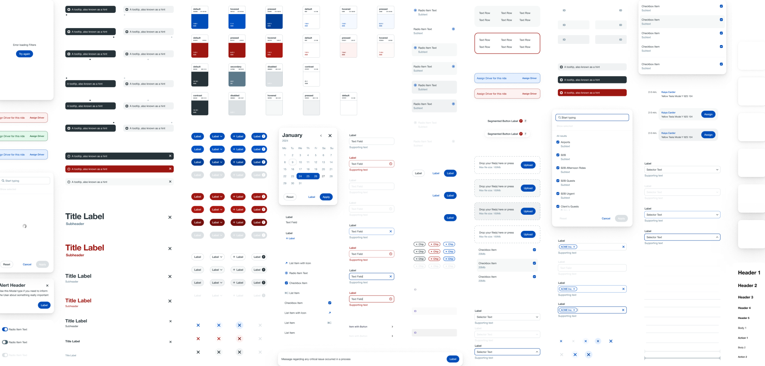
We started not with a grand blueprint, but with the atoms of the interface: twenty core components like buttons and text inputs. These were the parts everyone used but no one agreed on. Our guiding principle was elegantly simple:
if three teams needed it, it was in. We let the collective need of the products dictate our priorities, listening to what the work itself required.
We refused to become gatekeepers. Our role was facilitation, not the design police. We created a simple process where any team could propose new components to start a conversation.
The breakthrough came when we made engineers collaborators, not just implementers. Involved from the earliest sketches, their focus on the practical API was crucial. They challenged our assumptions, pressed on edge cases, and ensured our clean concepts worked flawlessly in practice. This partnership transformed stylish spec sheets into a trusted, robust toolkit.
Baking In Accessibility
We made WCAG 2.1 AA compliance non-negotiable. Every component launched with contrast-checked color tokens, keyboard navigation for complex patterns, and error states that actually helped users understand what went wrong.

Treating Documentation
as a Feature
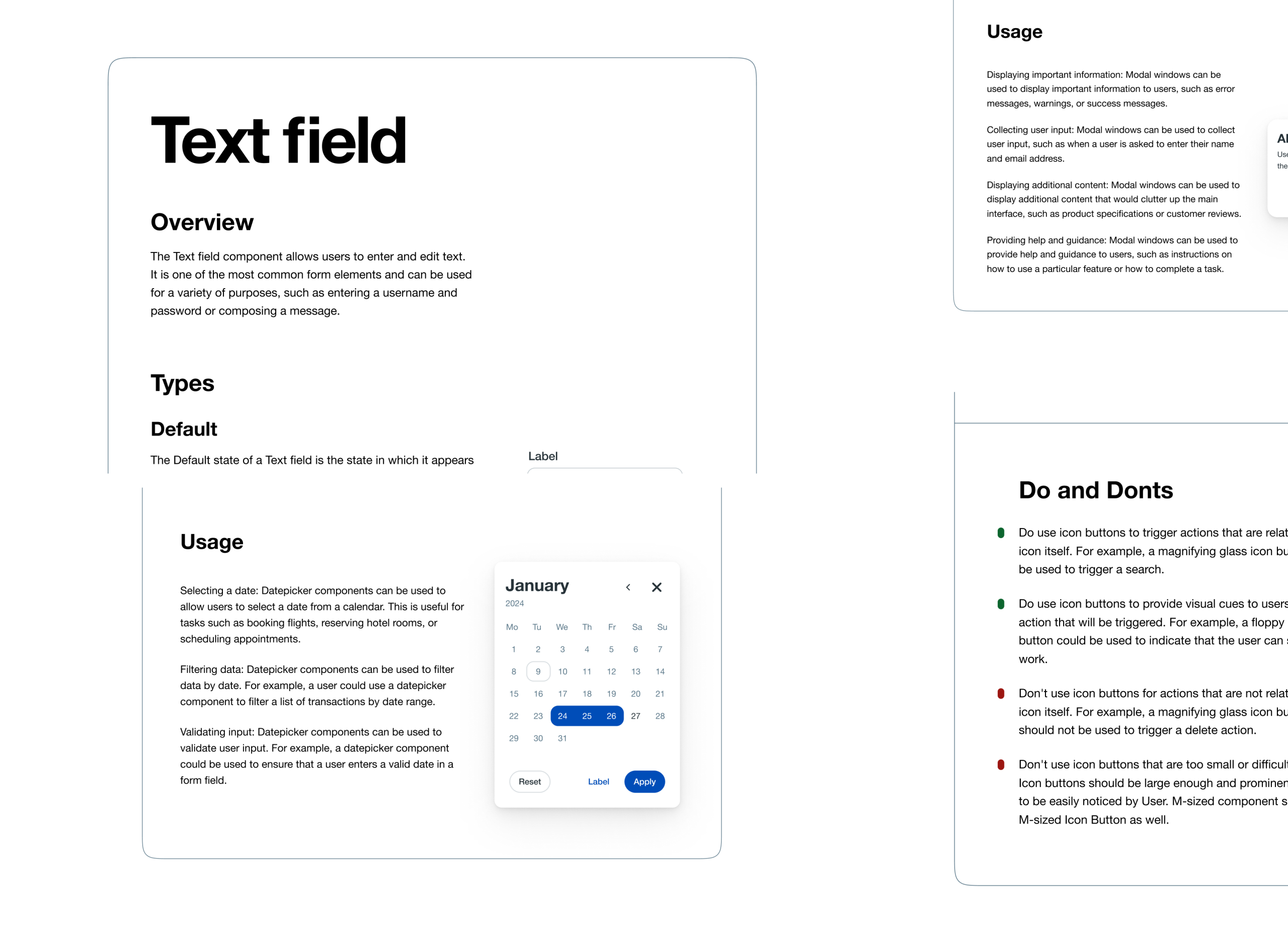
We made Storybook our single source of truth. It housed usage guidelines with real copy examples, visual anti-patterns showing what not to do, and developer API specs covering all edge cases.

The Wisdom We Gained
Starting small with core components built trust for more ambitious phases.
Taking an API-first approach meant developers helped shape components they would actually use.
Choosing progress over perfection prevented rigid standards from killing adoption.
Although we underestimated how much legacy tech debt would resist refactoring.
Some ideal patterns we designed needed adjustment based on real-world usage.
The New Reality
40 percent faster development as teams stopped reinventing interfaces, 90 percent adoption in six months through careful prioritization
80 percent fewer accessibility bugs by building compliance in from the start. Engineers celebrated handoffs, noting they finally received specs that anticipated edge cases
One year later, new hires onboard with the simple direction that everything lives in Gett.UI. Features now ship with pre-audited accessibility. Teams spend their time solving meaningful problems rather than pushing pixels on buttons.
The best design systems multiply effort instead of dictating it. By focusing on reuse without rigidity and standards without stagnation, we transformed inconsistency from a tax into an accelerator that helps everyone move faster.
next case study
Gett.UI Design System