
Tabby
Advance
Tabby, the UAE's BNPL unicorn, built its magic on speed and simplicity. Loans, by their nature, introduce longer terms and more conditions. We faced a delicate balance: maintain the app’s effortless feel while giving a responsible, transparent loan experience.
The question wasn’t just where to put a new button, but how to make a fundamentally different product feel like a natural extension of Tabby.
Finance Design Lead
Andrei Khudiakov
Teams Involved
Business, Analytics, Dev, Research
Gett Inc.
Data Visualization. Interface.
2019 – 2022
As Design Lead, my role was to navigate the gentle paradox of growing a simple product. We were introducing personal loans into Tabby’s "Buy Now, Pay Later" world, a place where speed and clarity were the entire point.
The challenge wasn't merely technical or even experimential, but almost philosophical. How do you invite the long-term commitment of a loan into the experience built on lightweight decisions?
Our task was to redesign the hull, to find a form that could carry this new complexity without sinking the simplicity our users loved. We weren't just building a feature; we were learning how a product matures without losing its soul.

The Architecture of Trust
Introducing a loan meant asking users to extend that trust over months, not days. This required designing a new dialogue—one that felt equally transparent, but for a much longer and more complex relationship. The interface had to bridge the gap between an impulse and an investment.
Our Legal team needed us to be very clear about costs. Our Product team wanted the process to be quick. And our users just wanted to understand how this was different. Our job was to find a design that worked for all of them.
Bridging the Cognitive Gap
How do we make the long-term commitment of a loan feel as immediate and understandable as a four-payment plan? We couldn't rely on the same mental models.
Designing a Gradual Disclosure
How do we present the necessary complexity: terms, interest, schedules, without overwhelming the user upfront? The truth had to unfold at the right pace.
Preserving the Product's Soul
How do we add weight without making the entire app feel heavy? The new feature had to feel integrated, not just attached, protecting the simplicity that defined the brand.
Designing the Bridge
We began by mapping the entire user journey across both products. This visual blueprint showed us where the paths aligned and where they diverged, helping us identify which components we could share and which needed entirely new thinking.

We learned where the experience dragged. We saw the moments of hesitation, the points of confusion. Then we smoothed them over. The slow money became smart money.
The Grace
of Progressive Disclosure
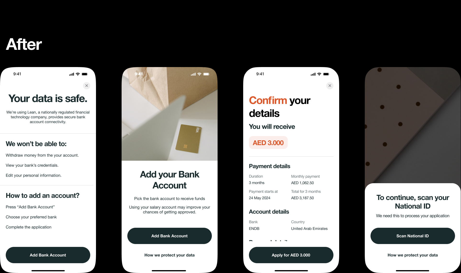
Instead of showing all the loan details at once, we showed the most important information first. Users could then choose to tap to see more details if they wanted. This kept the experience clean. We also placed the loan option in a few logical places in the app, so it felt natural.
We Listened and Adapted
Testing with real users showed us what worked. We focused on the steps in between. Instead of hitting users with a wall of legal text, we treated it like a conversation. We added simple explanations like "This affects your total cost" to make the fine print feel helpful, not hostile.
The goal was to guide people through, not stop them in their tracks.
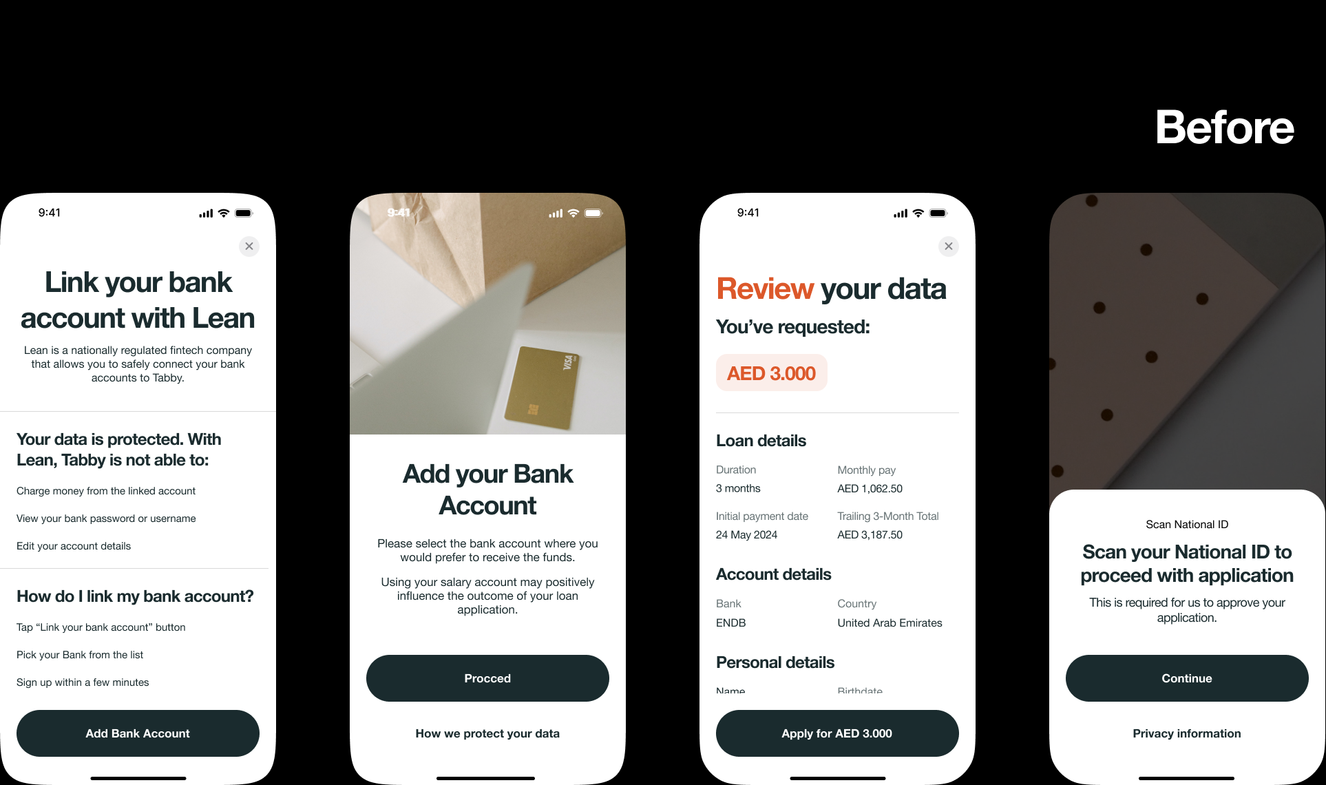
"Trailing 3-Month Total" was a locked door. "Total for 3 months" was an open one. We learned that the most elegant interface is useless if the words don’t speak the user’s language. A short, summary that explains why terms matter, can build more trust than a perfect compliance document.
Words matter.
The Necessary
Conversation
We stopped fighting gravity. The compliance check was a wall we couldn't design away. So we built a gentle ramp up to it instead.
The interface learned to breathe between questions. We gave users room to understand what was happening, using consistent rhythms and predictable steps.
When the legal gate appeared, it felt like the next natural step in the dance rather than someone changing the music. We made the mandatory feel intentional, the complex feel coherent.
A good path doesn't avoid the hill, it makes the climb feel worth it.
We learned where the experience dragged. We saw the moments of hesitation, the points of confusion. Then we smoothed them over. The slow money became smart money.
The Results
The numbers told a simple story: when you make things clear, people use them. Support tickets about loan terms dropped off because the product finally made sense at a glance.
For the business, it was a quiet win. The loans landed without drama, proving we could handle complexity without becoming complicated. It opened a door for what we could build next.
The goal wasn't to hide the complexity of loans. It was to organize it so well that it felt simple. We proved that a powerful product can still be easy and clear to use.
Products need room to grow up. Our work on loans taught us how to add depth without clutter.
Future Plans
Products need room to grow up. Our work on loans taught us how to add depth without clutter.
Now we're building Tabby's living room, a place where every service has its own chair, but shares the same light. The best features know how to belong.
next case study
Gett.UI Design System