
SRI MDM Service
As Lead Designer at SRI, I faced a curious paradox: our security platform protected giants like Gazprom and Rosneft, yet its own interface had become a vulnerability. We'd built a toolbox where the tools kept hiding from their users.
My task was to bring order to this well-intentioned chaos: to transform a collection of client-specific solutions into a coherent language of security. I had to teach our system what it had forgotten: that true protection begins with understanding.
Finance Design Lead
Andrei Khudiakov
Teams Involved
Business, Analytics, Dev, Research
Gett Inc.
Data Visualization. Interface.
2019 – 2022

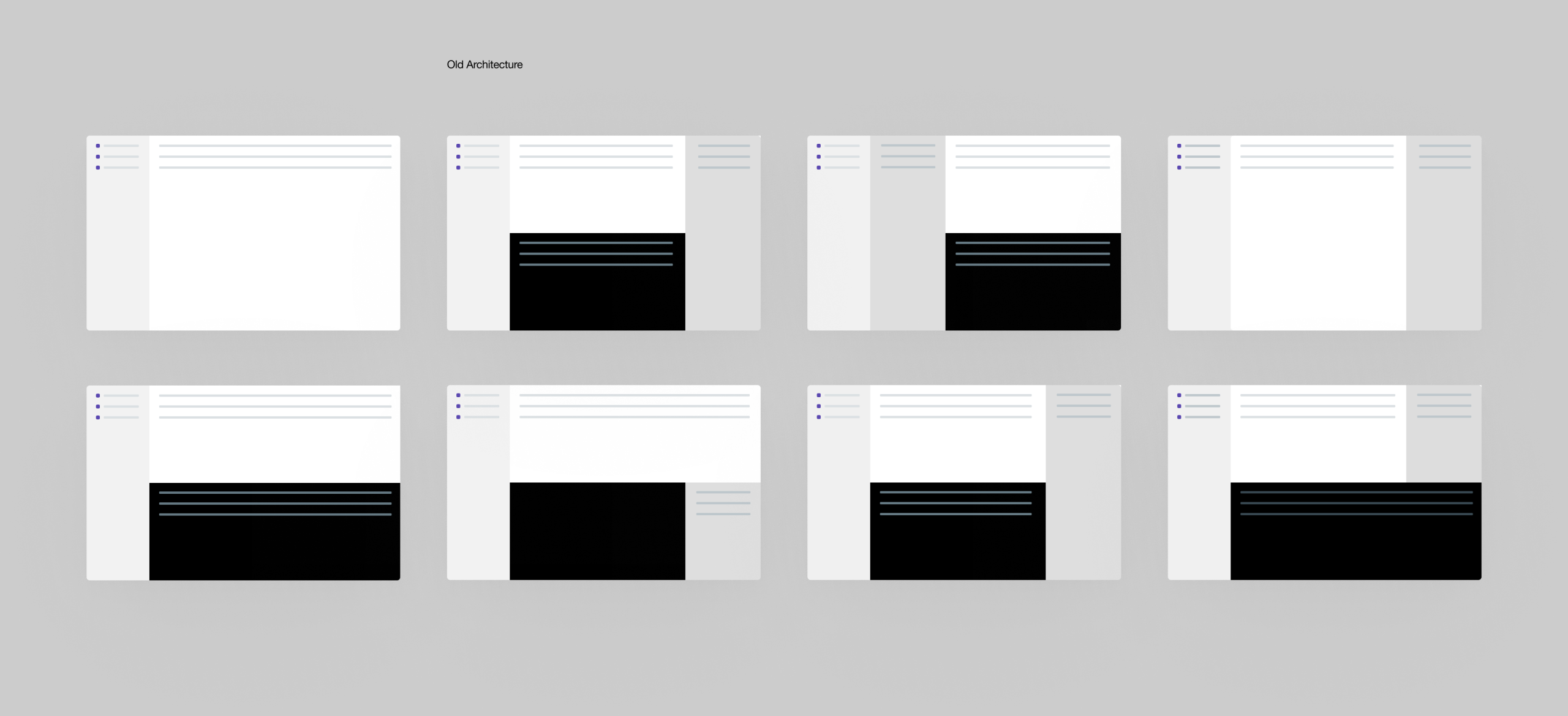
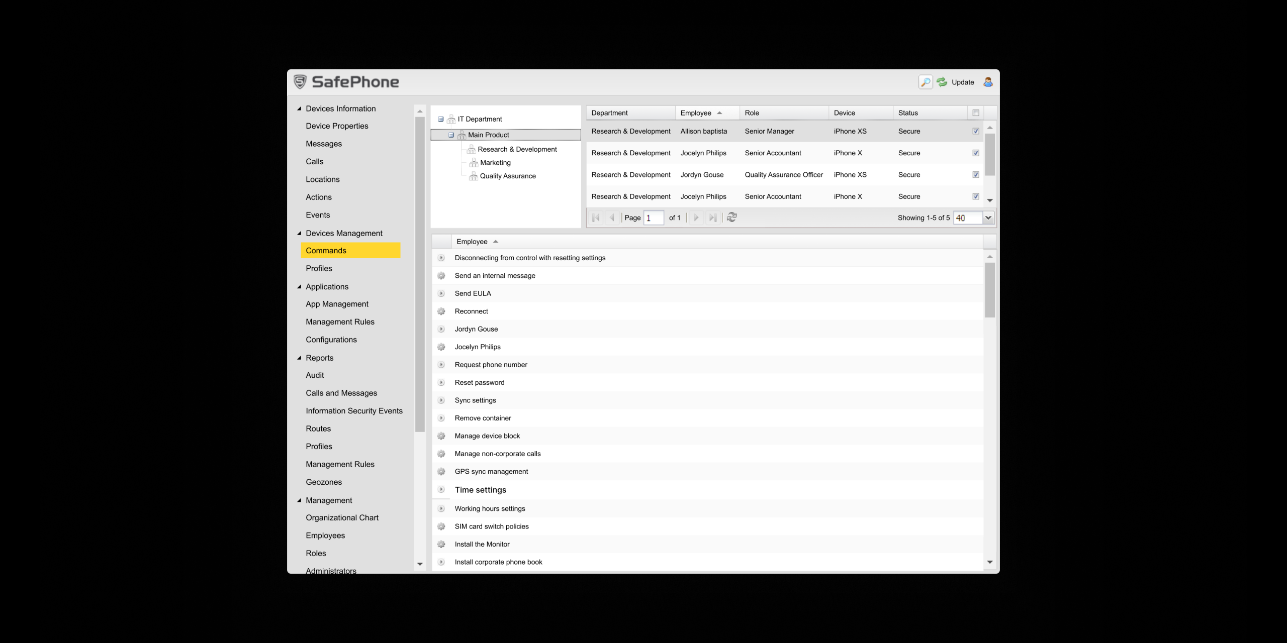
SRI's Mobile Device Management platform, trusted by organizations like the Bank of Russia and Gazprom, was buckling under its own success. The interface had become a patchwork of conflicting patterns as each client request introduced new mechanics. Small fonts and poor contrast ratios made the system difficult to use, while inefficient layouts forced unnecessary scrolling despite ample screen space.
The platform designed to secure enterprise mobility had become a security risk from its internal complexity.

The Art
of Reconstruction
We discovered our platform had been quietly breaking its own rules. Like a city that grew without a master plan, every well-intentioned addition had created unintended complexity.
The Customization Trap
We became tailors who only made one-of-a-kind suits. The platform grew a wardrobe of perfect solutions that fit nobody.
The Space We Wasted
We built cathedrals of empty pixels while administrators searched for buttons in the shadows.
The Pattern of No Patterns
Similar functions learned to speak different languages, and the system forgot its own grammar.
The Reconstruction
We rebuilt around simple truths. Every page learned the same three-part harmony: navigation left, content center, actions right. Administrators suddenly knew where to stand in every room.
We taught the interface to speak one language. Applications sorted themselves logically, commands followed consistent rhythms, and location tracking became a dialogue instead of an interrogation.
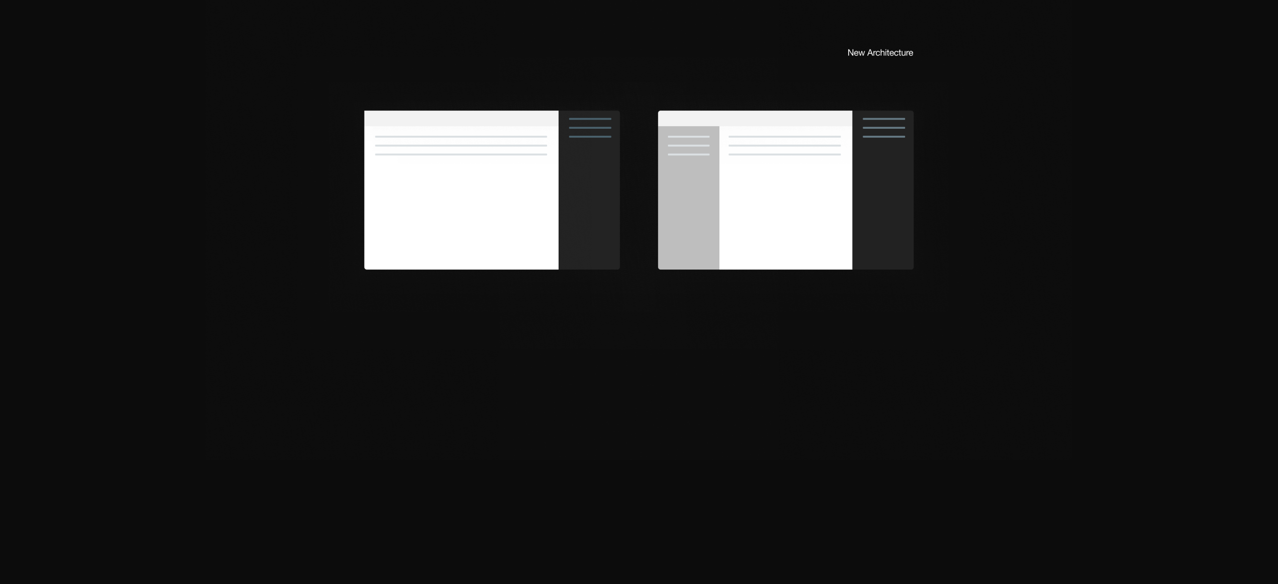
We learned to furnish the empty spaces. Maps replaced endless tables, controls appeared where fingers expected them, and every pixel finally carried its weight
Most importantly, we listened to those who lived there. Testing with administrators revealed what we'd been missing: true clarity is measured in confidence, not just completion rates.
Drag the handle to compare previous and redesigned MDM System experience.
The New Rhythm
The system now speaks one language across all its functions. Administrators can manage applications, deploy commands, and monitor locations through consistent patterns that feel discovered rather than taught. We restored the clarity that makes true security possible.

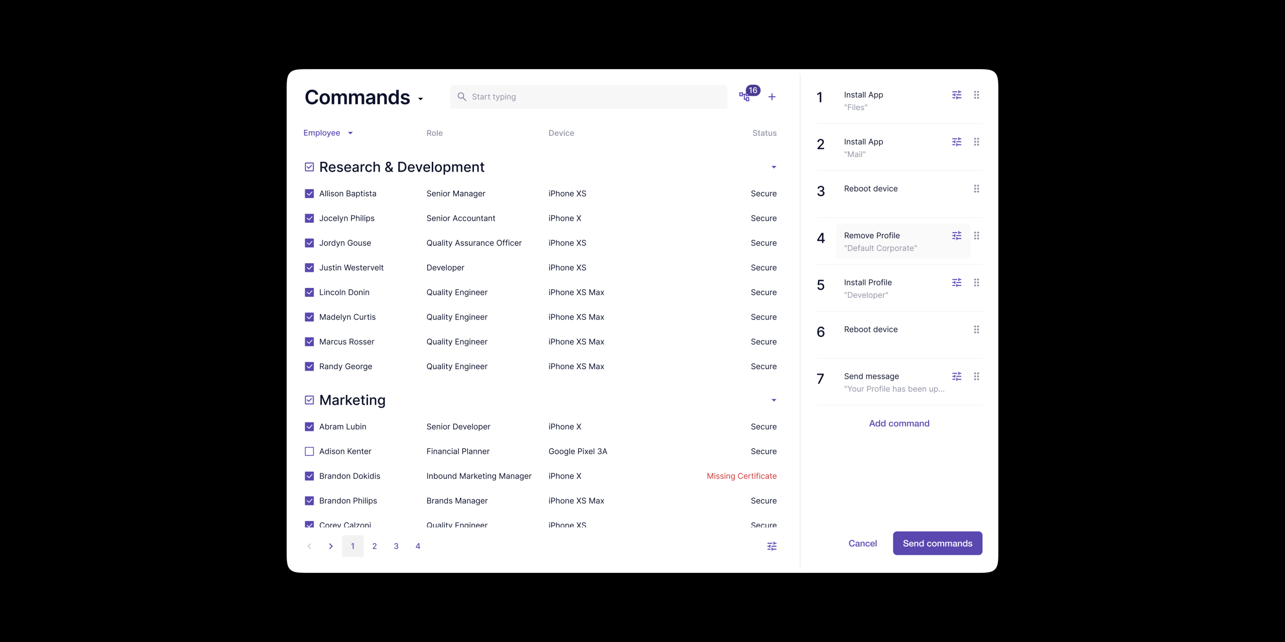
Commands is where administrators speak to devices. A vocabulary of action: install, wipe, message, restrict, each word a sentence that changes what a device becomes. The interface makes this power feel simple. Complexity isn't hidden, just made simple.
The Approved Toolbox
The Applications section learned to wear its new architecture like a well-tailored suit. On the left, the entire universe of permitted apps. On the right, the quiet power to shape it.
This is where software earns its credentials. An app in this list has the company's permission to run. An app outside it does not. The act of uploading an application transforms it from a simple tool into sanctioned policy.
We built this space for curators, not just administrators. The design makes a weighty responsibility feel simple to execute. Every clear choice, to allow, to block, to deploy, defines the tools an entire organization can use.
The left side knows what apps we have. The right side knows what they're meant to do. One side is the library, the other is the rulebook.
Where Policy
Meets Place
Online Routes reveals the redesign's quietest victory: making the abstract deeply human. This is where policy learns geography. We turned the map into a living ledger. Instead of coordinates in a database, administrators see their fleet breathing across city grids.
A geozone is the gentle hand on a device's shoulder to guide it. It's the moment a building whispers its rules to a passing phone, and the phone whispers back, "Understood."
This view, perhaps more than any other, embodies our philosophy. We took the profound complexity of real-time location data and let it settle into simple, visual truth. Security became less about tracking devices and more about understanding journeys.
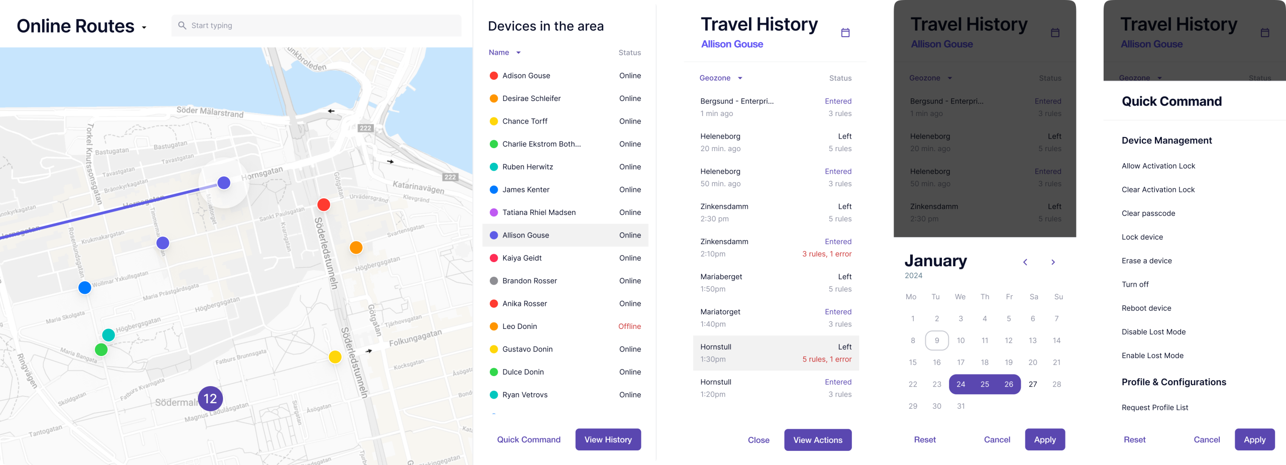
The map collects the small stories of the workday: the coffee stop that ran long, the meeting that ended early. It remembers what we would otherwise forget.
The Work, Measured
The data began to tell a different story. Tasks that once took minutes now resolved in moments—device location and app deployment became 40-50% faster.
Our support team noticed the quiet. "How do I" questions fell by 30%, as if the interface had learned to answer on its own
We saw tools that were once ignored find their audience—Geozones and Commands saw 25% more use. New administrators learned in half the time. But the real story was in the work itself: fewer mistakes, more foresight. The platform had become less a system to operate and more a partner to think with.
The Outcome
We learned that enterprise security tools carry a unique burden—they can't afford to be mysterious. The real work was in rebuilding that trust, and we knew the only material we could use was absolute clarity.
We stopped making administrators guess. When every action lives where you expect it, and every command speaks a language you understand, the interface itself begins to fade away. What remains is a quiet certainty. And in our world, that confidence isn't a nice-to-have—it's the final layer of security.
next case study
Gett.UI Design System