
Tabby Loans
Tabby’s magic lives in its speed and simplicity. Loans, by their nature, introduce longer terms and more conditions. We faced a delicate balance: maintain the app’s effortless feel while giving a responsible, transparent loan experience.
The question wasn’t just where to put a new button, but how to make a fundamentally different product feel like a natural extension of Tabby.
Finance Design Lead
Andrei Khudiakov
Teams Involved
Business, Analytics, Dev, Research
Gett Inc.
Data Visualization. Interface.
2019 – 2022

Our mission was clear: untangle the knot. The support portal had become a museum of design decisions, each layer obscuring the one before it. Agents navigated not one interface but several, each from a different era, with critical functions scattered across legacy services.
To understand a ride’s story, they had to become archivists, piecing together a timeline from fragments. This cognitive tax was measurable: CSAT languished at 68%, and every interaction took too long. My team was tasked with a simple, ambitious goal: cut average handle time in half.
Drag the handle to compare previous and redesigned Ride Details experience.

The Art
of Reconstruction
We watched the best agents work. Their secret was simple, and profound. For every complex case, they would pause. They would piece together the customer's story from scattered data points, reconstructing events on notepads. They were reverse engineering the problem before they could solve it.
The Inconsistency Tax
Feature development moved 40 percent slower due to redundant UI work. WCAG failures triggered last-minute refactors that derailed schedules. New hires faced confusion, constantly asking which version of which component they should use.
The Clear Opportunity
Stakeholders agreed that scaling required standards. Our challenge was proving a design system could actually speed up work without adding bureaucracy, and preserve flexibility without stifling innovation.
Building
Unified Narratives
The core of our approach was unification. We didn't just redesign the portal; we absorbed the legacy systems. Driver assignment, billing adjustments, and passenger communications—functions that once lived in separate, disjointed services—were integrated into a single, coherent experience.
We established one set of interaction patterns, one visual language, and one information architecture.

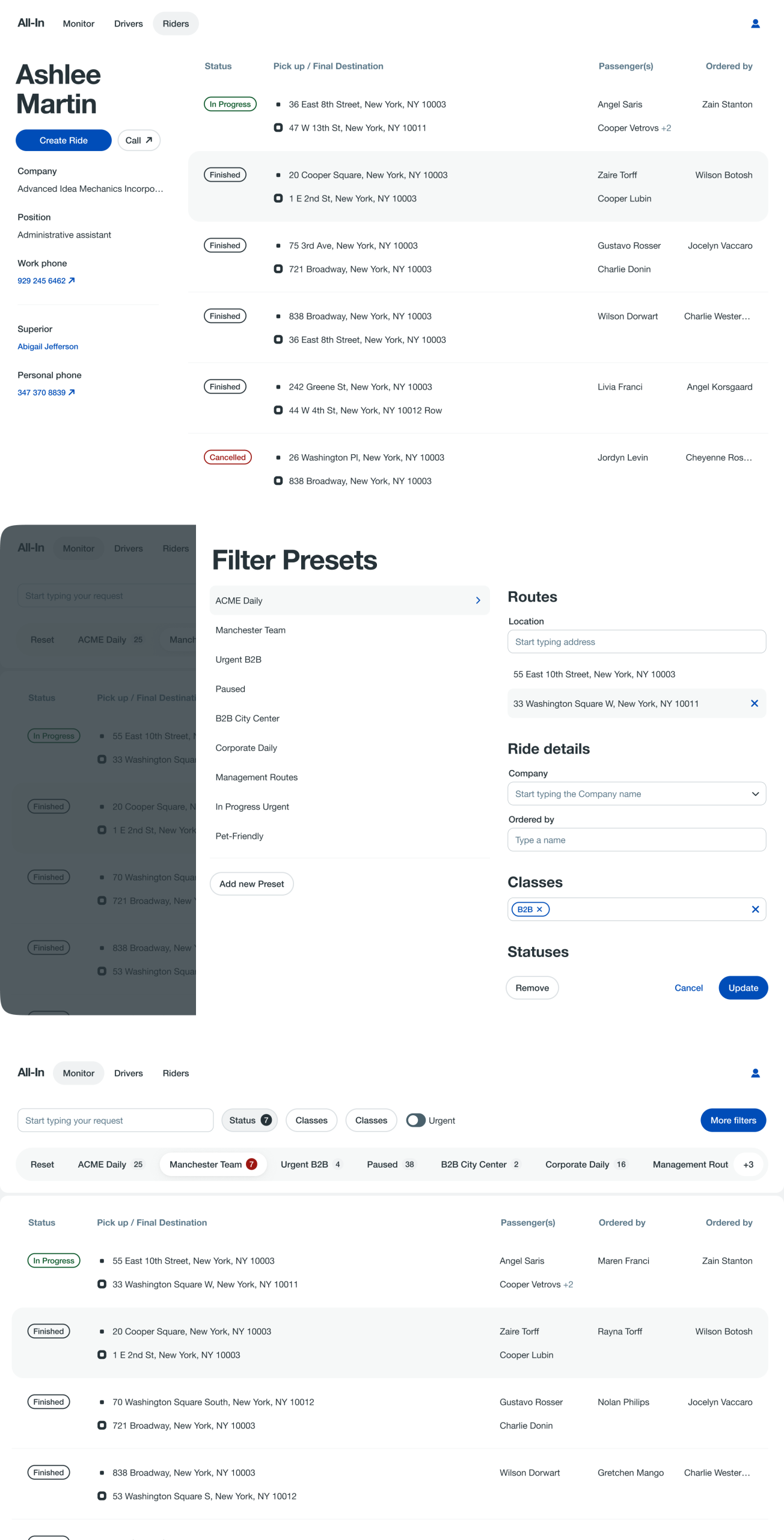
The Monitoring Service presents every active ride, everywhere. To make this global scale useful, we built in the ability for an agent to carve out their own slice, filtering down to the specific classes of customers or types of issues they own. It gives everyone a view of the whole, and the tools to focus on their part.
The Whole World,
a Manageable Slice
We gave administrators the keys to the universe. They can now sculpt customer groups on the fly, creating, modifying, and assigning them to agents with a few clicks. A segment can be shared across multiple people, ensuring the right eyes are on the right slice of the world at all times. It’s organizational clarity, built directly into the interface.

The Person
Behind the Profile
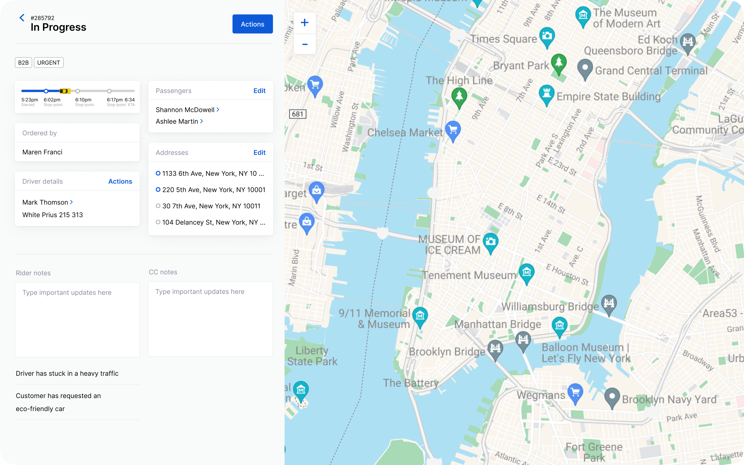
Every Gett driver, everywhere, now has a home within All-In. With a few keystrokes, an operator can pull up a driver's complete profile, review their entire ride history, or place a direct call. It turns a name in a log into a person you can actually help.

Making Sense
of Time
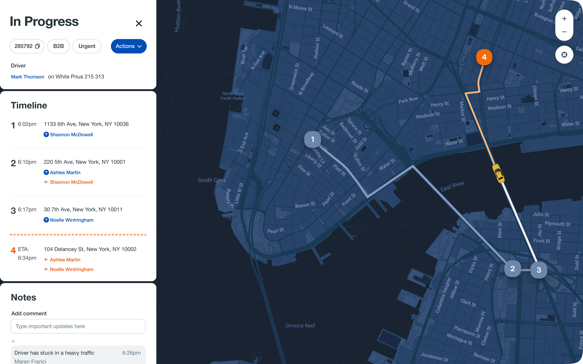
The cornerstone of this new experience was a visual timeline,
a chronological ledger of the ride. We rendered the journey not as a list
of data points, but as a narrative. Color and iconography surfaced problems instantly, turning minutes of detective work into a moment of understanding.
The ride details now embrace change. Instead of cancelling a ride to alter it, agents can seamlessly add multiple destination points or assign a new driver directly within the timeline. The entire experience is structured chronologically, allowing these adjustments to be made in context, treating the ride not as a fixed record, but as a living, malleable journey.
The Outcome
The results spoke to the power of a coherent system. Average handle time dropped from over four minutes to just ninety seconds, a 62% reduction that surpassed our 50% goal. CSAT soared by 21 points to 89%. We also saw a 23% drop in assignment errors and a 40% increase in the adoption of related monitoring tools, a testament to the reusable patterns we established.
The real victory was in the ripple effects. The project became a proof-of-concept for our design system, accelerating its adoption across other products. New hires now onboard faster, equipped with a tool that clarifies instead of confuses.
The most elegant solution is often the most direct one: present the story, provide the tools, and get out of the way. Good design amplifies skill, and in this case, it turned a daily struggle into a clear path forward.