
Alfa Bank
Subscriptions
At Alfa-Bank, Russia's largest private bank, we had a subscription feature that was perfectly useful and perfectly hidden. Business customers kept hitting transaction limits while the solution sat quietly in their accounts, waiting to be discovered.
s Principal Designer, I helped bring it into conversation with the people who needed it. We learned that a finished product is only half done and the other half is making sure people can find it.
Principal Designer
Andrei Khudiakov
Teams Involved
Business, Analytics, Dev, Research
Gett Inc.
Data Visualization. Interface.
2019 – 2022

Alfa bank had a subscription feature that business customers genuinely needed. There was just one tiny problem: it was the best kept secret in our app. Customers kept hitting transaction limits while our solution sat quietly in the corner, waiting to be discovered.
The numbers told the story: adoption was 30% below projections. Yet the real plot twist? Everyone who actually used subscriptions loved them. We hadn't built a bad feature, we'd built an invisible one.
Drag the handle to compare previous and redesigned Ride Details experience.

The Visible
and the Vague
We had built a room nobody could find the door to. The subscription feature was technically live, but practically invisible, buried beneath layers of interface indecision and competing priorities.
The Silent Interface
The management screen presented a perfectly alphabetical, perfectly useless list. Critical details were buried, and active subscriptions were given no visual priority over inactive ones.
The Constraint Labyrinth
Technical limitations ruled out rich graphics, while three different teams held conflicting requirements. We were designing with multiple hands tied.
The Timeline Paradox
We had three months to solve a problem that required rethinking fundamental navigation, forcing us to choose between comprehensive and achievable.
We Gave Numbers
a Voice
We turned our wallflower into the life of the party. The new design showed limit increases and cost savings upfront, putting active subscriptions front and center. No more treasure hunts required.

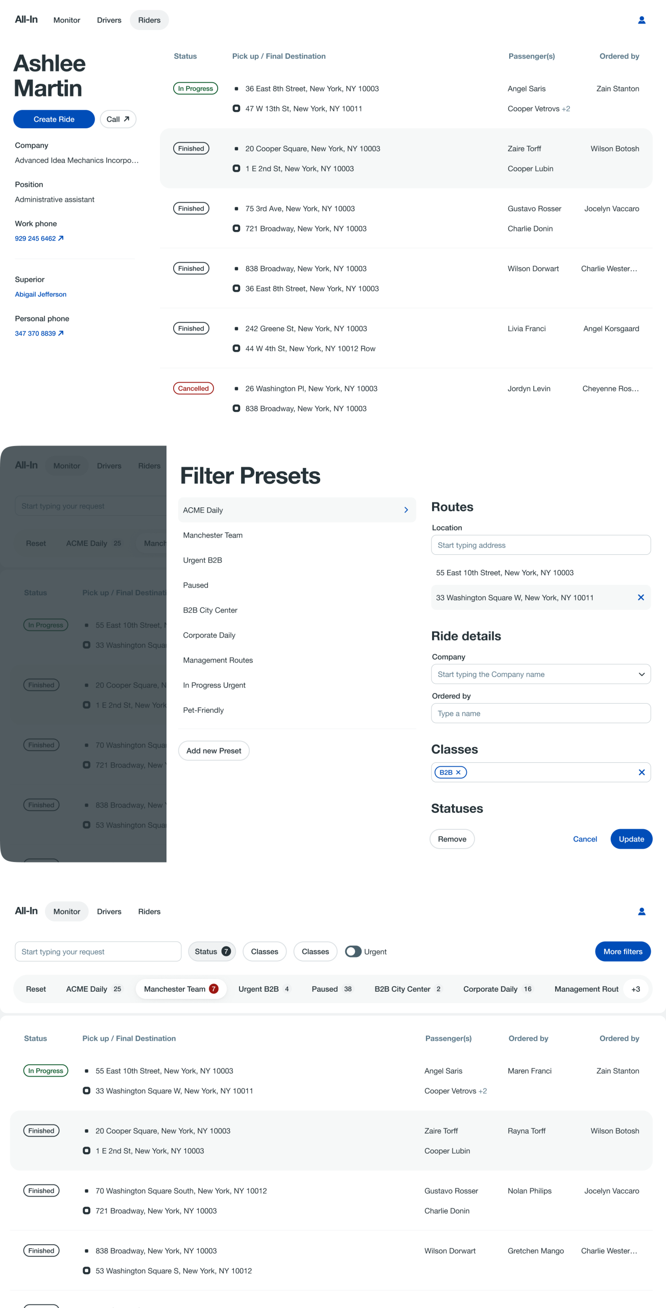
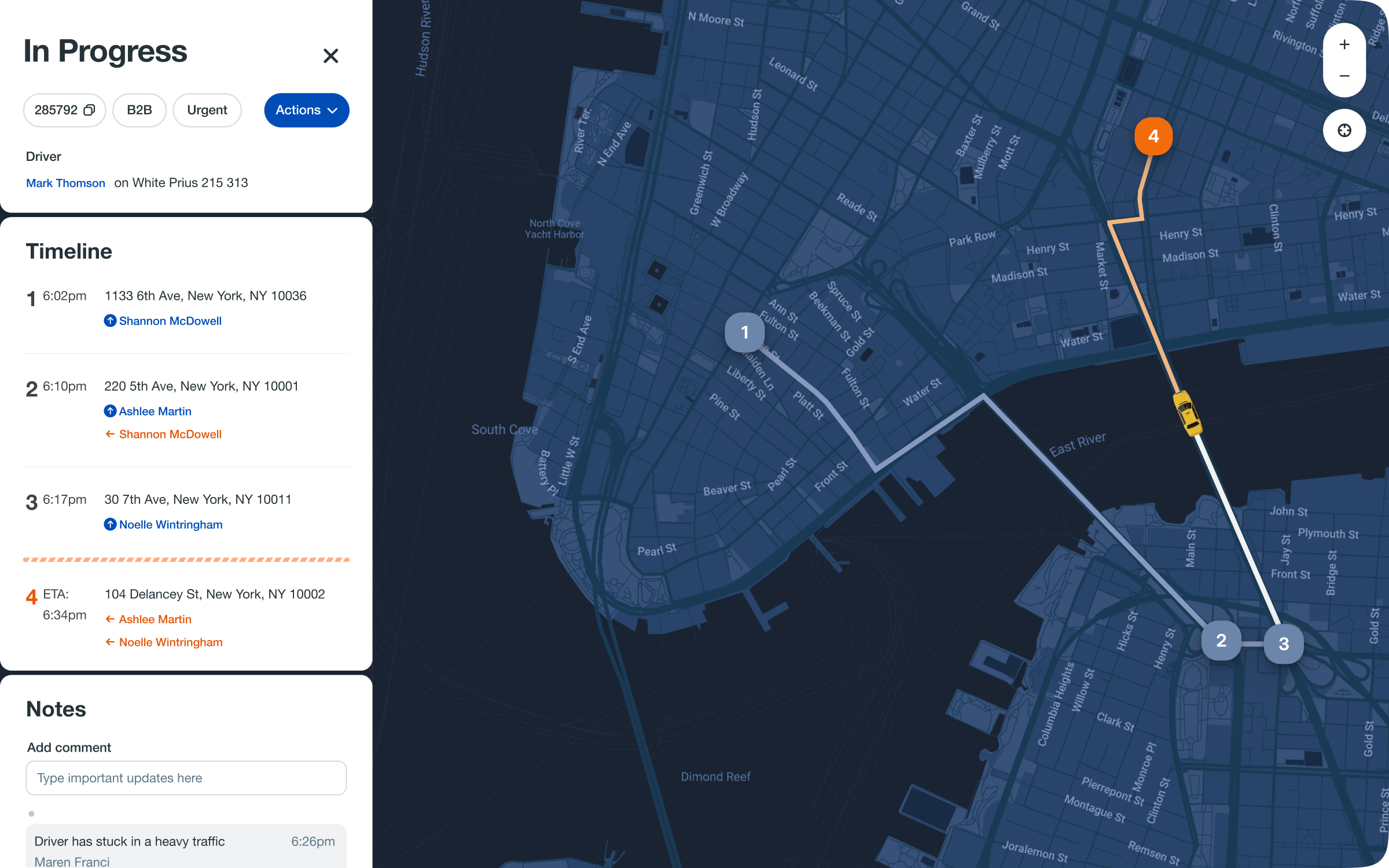
The Monitoring Service presents every active ride, everywhere. To make this global scale useful, we built in the ability for an agent to carve out their own slice, filtering down to the specific classes of customers or types of issues they own. It gives everyone a view of the whole, and the tools to focus on their part.
We Embraced
the Sticky Solution
When we realized users weren't scrolling, we didn't ask them to change. We changed instead, adding a persistent "Add Subscription" button that followed them around like a helpful assistant.
We United the Tribes
We got everyone singing from the same songbook, focusing on clarity over decoration. Sometimes the most elegant solution is the one that actually solves the problem.

The Victory Lap
Subscription sign-ups grew by half. People tend to use the tools they can see. Support questions fell by a quarter. The interface had learned to speak for itself. We shipped in ten weeks. And we discovered that the most elegant solution is often the one you can actually finish.
A good solution delivered today is more valuable than a perfect one planned for tomorrow. Testing early showed us what our late assumptions had overlooked. We learned that if you want users to take action, you must place the path directly before them.
We also discovered that technical schedules operate on their own calendar. Often, the most sophisticated choice is the simplest one available. Perhaps most importantly, we saw that alignment across teams isn't just beneficial—it's fundamental to the product itself.
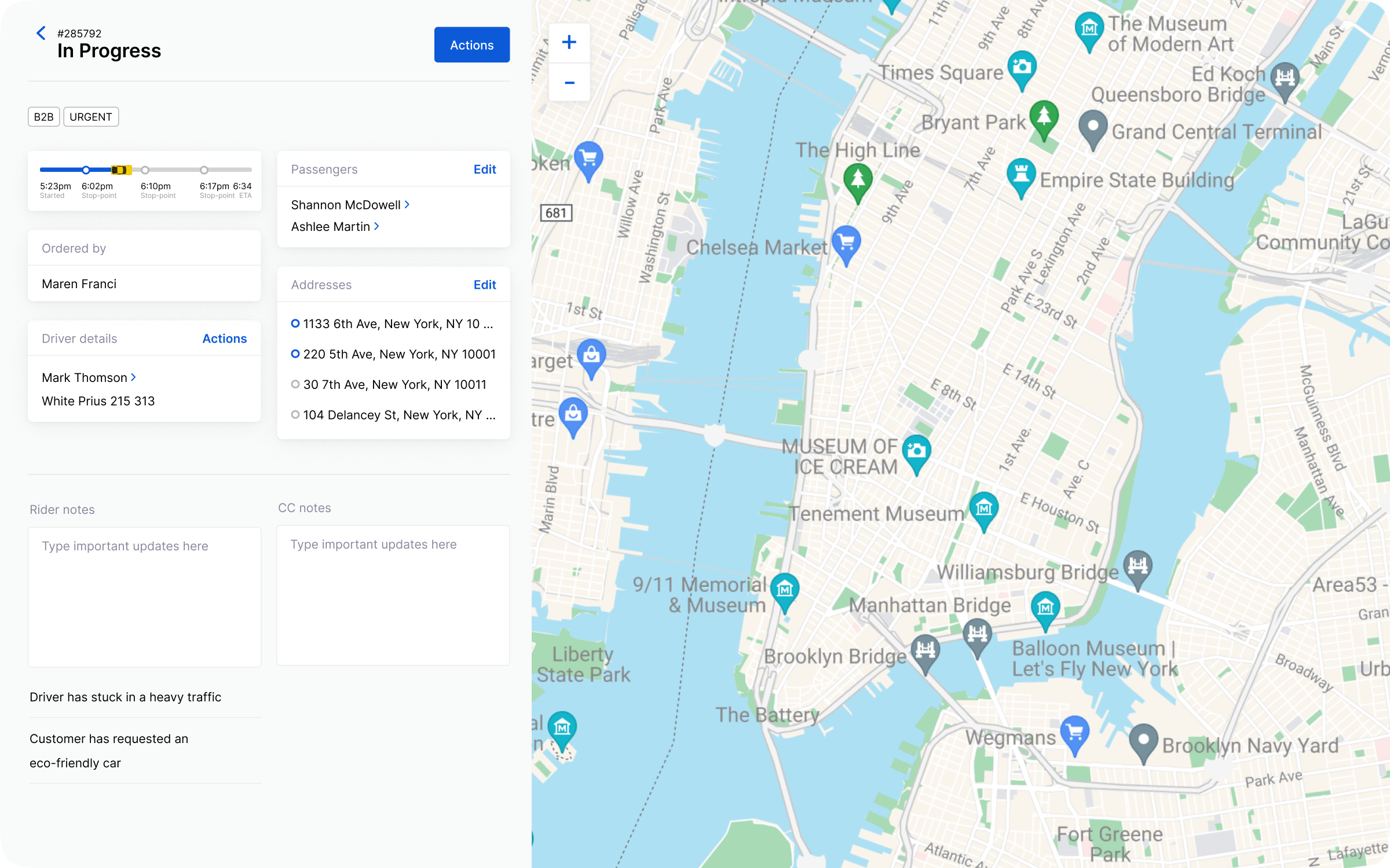
The ride details now embrace change. Instead of cancelling a ride to alter it, agents can seamlessly add multiple destination points or assign a new driver directly within the timeline. The entire experience is structured chronologically, allowing these adjustments to be made in context, treating the ride not as a fixed record, but as a living, malleable journey.
The Next Chapter
We're bringing in the visual flair we originally planned, adding smart suggestions that anticipate needs, and making subscriptions feel less like an add-on and more like the main event.
We learned that great features don't need rebuilding—they just need to be seen. Our job wasn't to create something new, but to help something wonderful step into the spotlight.
next case study
Gett.UI Design System