
SRI Design
System
SRI's MDM solution was drowning in its own complexity. The interface lacked clear hierarchy, making important data difficult to find. Buttons that looked the same behaved differently across the platform. Engineering time was wasted building custom components for every new feature.
The irony was hard to ignore: the tool designed to manage complexity had become overly complex itself.
Design Lead
Andrei Khudiakov
Teams Involved
Business, Analytics, Dev, Research
Gett Inc.
Data Visualization. Interface.
2019 – 2022

Administrators wasted precious time hunting for settings in a sea of visual sameness. Inconsistent patterns meant similar functions had different interfaces, while different functions sometimes used the same UI. The component library was bloated with one-off solutions that saw zero reuse.
Engineers were rebuilding the same UI elements month after month, wasting approximately 200 hours each month. New features were slowed by this accumulating UI debt, and training took longer because nothing behaved predictably.
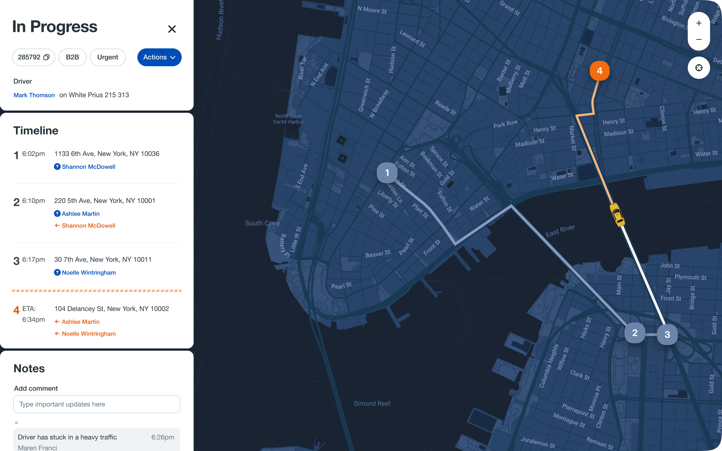
Drag the handle to compare previous and redesigned Ride Details experience.

The Weight
of Inconsistency
We discovered our interface had been accruing interest on a debt of poor decisions. Administrators were losing time navigating unpredictable patterns, while engineers were trapped rebuilding the same components. The system was costing us more to maintain than it was delivering in value.
The Usability Debt
Critical settings were camouflaged in a landscape of visual monotony. Inconsistent patterns meant every interaction required fresh learning, and our component library had become a museum of one-off solutions.
The Systemic Costs
Engineers were spending 200 monthly hours rebuilding interfaces that should have been reusable. This UI debt became the silent tax on every new feature and the hidden curriculum in every training session.
The Navigation Paradox
The very system designed to help users complete tasks had become the primary obstacle. We were making simple things complex through sheer accumulation of inconsistent choices.
The Minimum Maximum
Principle
We built only what was truly needed, avoiding speculative components. Our rule was clear: if a component existed in the library, teams could not build their own version. We sacrificed special behaviors for the greater good of consistency.

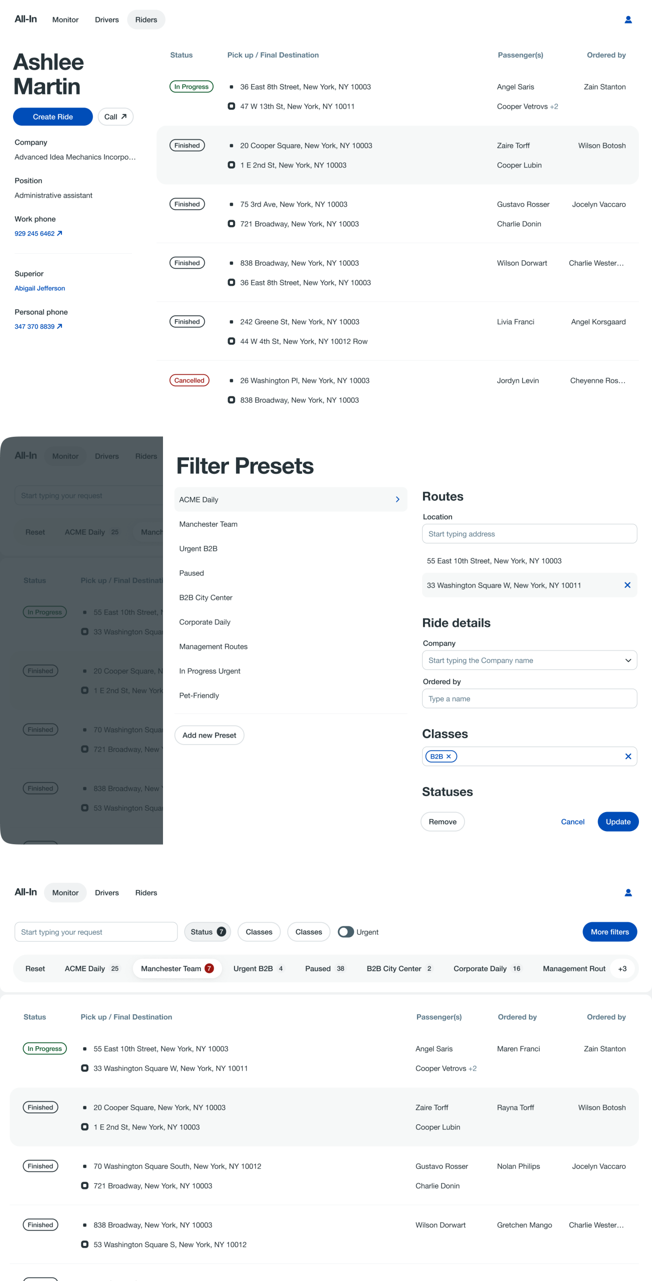
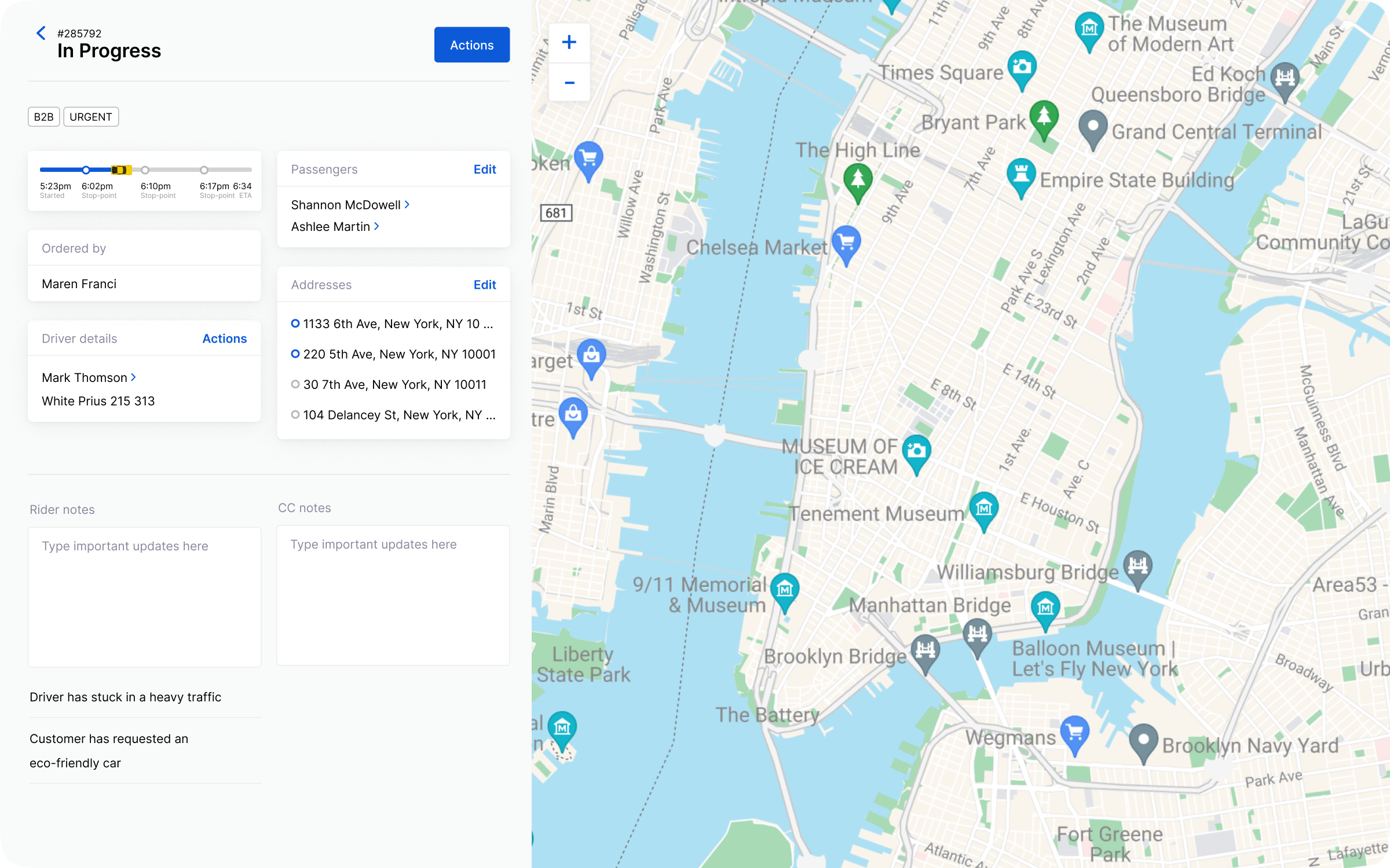
The Monitoring Service presents every active ride, everywhere. To make this global scale useful, we built in the ability for an agent to carve out their own slice, filtering down to the specific classes of customers or types of issues they own. It gives everyone a view of the whole, and the tools to focus on their part.
Accessibility
as Foundation
Every component met WCAG 2.1 AA standards from day one. We eliminated gray-on-gray text that failed contrast checks, fixed keyboard navigation traps, and created error states that actually helped users understand what went wrong.
Structured Layout
Building Blocks
We defined five core page templates for common patterns like detail views, lists, and forms. Engineers could now assemble pages like LEGO bricks instead of reinventing layout grids for every feature.
We allocated thirty percent of development time to design system work. Together we defined component APIs, established consistent breakpoints, and created naming conventions that finally made sense.

The Results
Feature rollout accelerated by half. The pre-built components did the heavy lifting, letting us focus on what mattered. Customer satisfaction climbed from 3.2 to 4.5. Users noticed the new coherence, their feedback shifting from frustration to quiet praise. We reclaimed 200 engineering hours each month.
The team stopped rebuilding the same solutions and started solving new problems. Training time contracted by a quarter. Predictable patterns meant we were teaching principles, not memorizing exceptions.
Constraints actually bred creativity as teams found innovative ways to use existing components.
Developer partnership prevented drift and ensured the system was genuinely useful.
Templates proved more effective than bespoke layouts for both building and learning.
We underestimated how deeply some legacy components were entrenched.
Early over-optimization led to time wasted on edge cases nobody actually used.
The ride details now embrace change. Instead of cancelling a ride to alter it, agents can seamlessly add multiple destination points or assign a new driver directly within the timeline. The entire experience is structured chronologically, allowing these adjustments to be made in context, treating the ride not as a fixed record, but as a living, malleable journey.
The Road Ahead
Dark mode support is next, followed by advanced component analytics to track real-world usage. We are also building a documentation portal to speed up adoption across teams
Good design systems do not just standardize; they accelerate. By trading special snowflake UIs for consistent patterns, we made the MDM platform easier for users to navigate, easier for engineers to build upon, and easier for the business to scale effectively.
next case study
Gett.UI Design System