
2025
Alfa Bank
Subscriptions
Alfa-Bank, Russia’s largest private bank, had a subscription feature for business customers who needed higher transaction limits and paid service packages. The product was useful, but buried inside the app, making it hard to find, understand, and activate.
I redesigned the experience around discovery, value clarity, and activation. The result: 156% growth in sign-ups and 25% fewer support questions in 10 weeks.
Industry
Banking
Role
Principal Designer
Focus
Monetization UX, Self-service activation
Business problem
The subscription product had clear commercial potential, but the interface treated it like another banking widget. It was buried, under-explained, and easy to ignore.
Design response
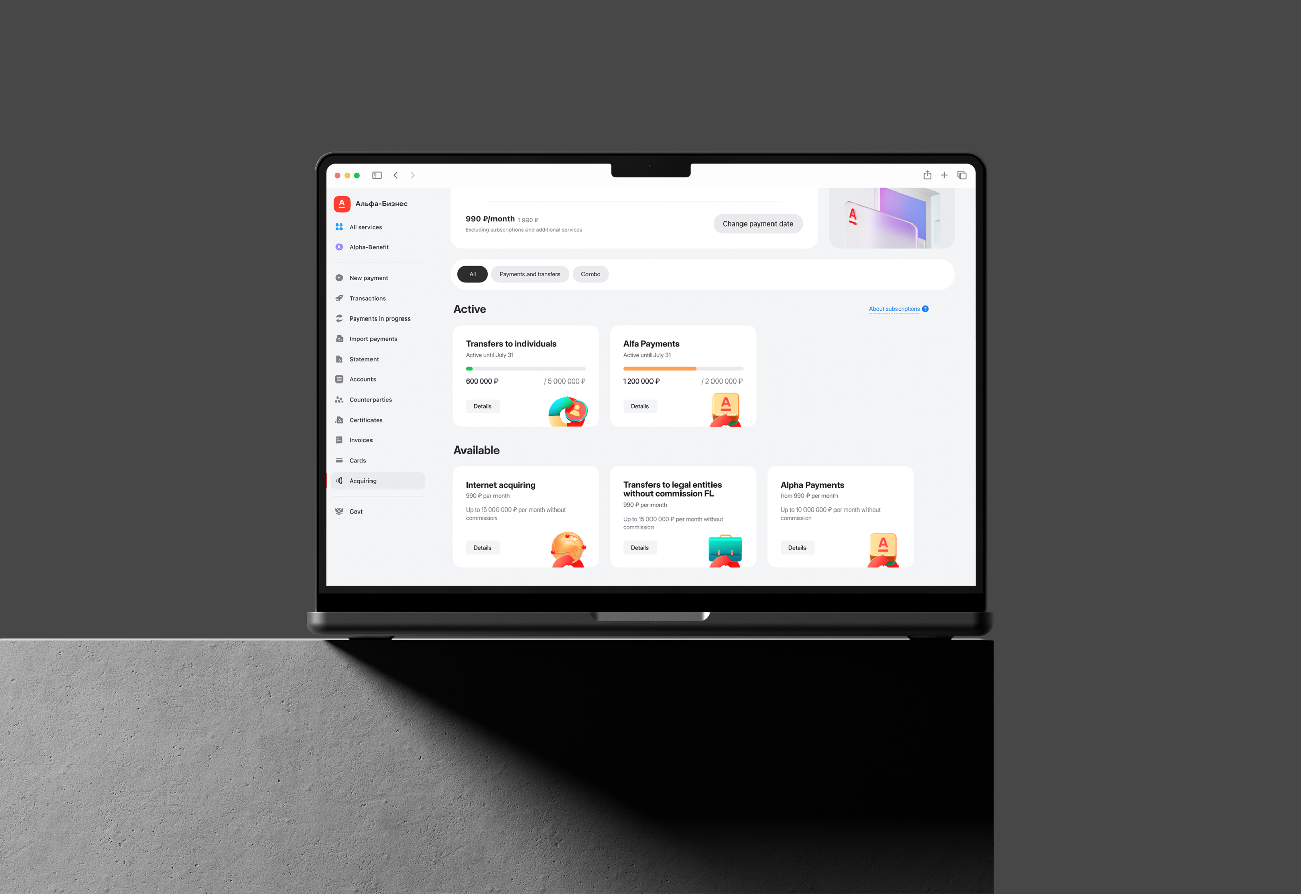
I redesigned the path from discovery to activation: clearer entry point, benefit-led hub, simpler activation logic, and more transparent limits and conditions.
Business result
I redesigned the path from discovery to activation: clearer entry point, benefit-led hub, simpler activation logic, and more transparent limits and conditions.
156%
Higher Sign-up Growth
23%
Lower VOC Complaint Score
25%
Fewer Support Questions

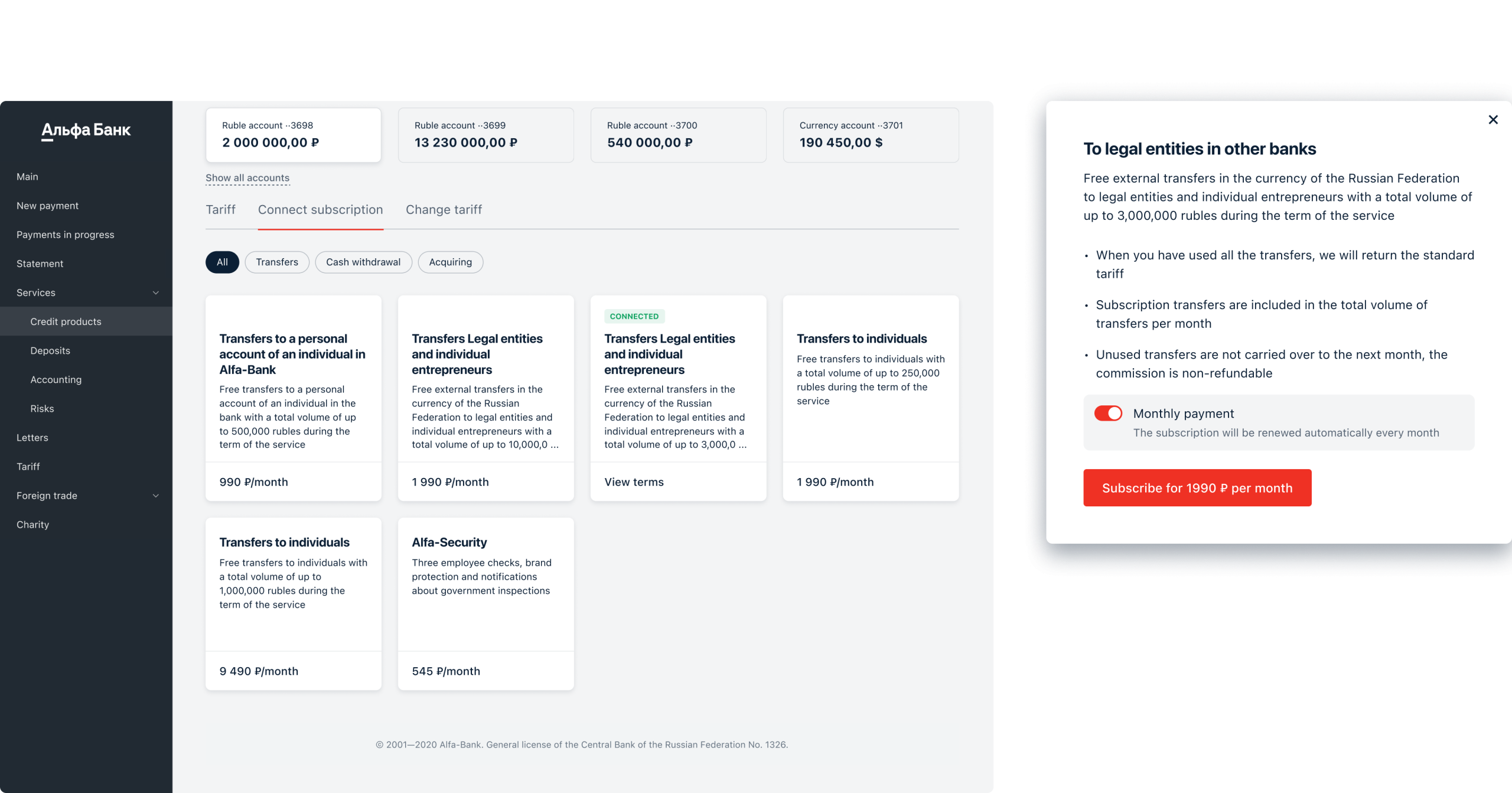
Business customers were running into transaction limits and contacting support, even though the app already had a self-service way to upgrade. The feature lived in a long list of similar service cards. The copy explained the product in banking terms, not customer value. The screens did not make it obvious what users would get, what would change after activation, or where to manage the subscription later. The product was there. The path to value was not.
The bank already had the solution. The interface just failed to sell it.
Lost in a List
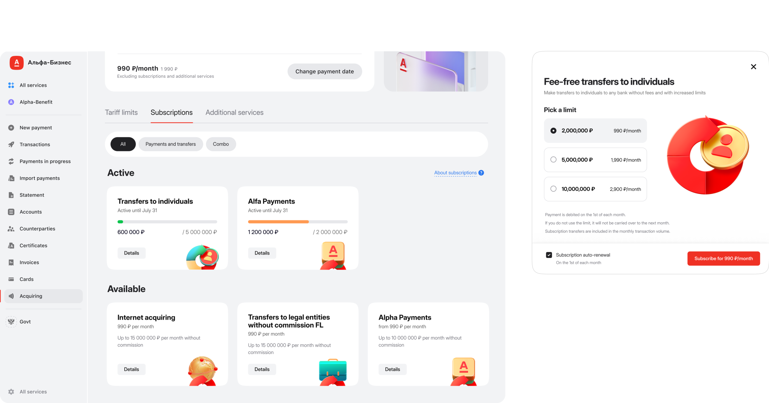
Most widgets followed the same pattern: title, short description, button. Active subscriptions had a small status tag, but the card still did not show enough useful information to support a decision. Users could not quickly answer:
- What is active now?
- What limit is available?
- What does the package include?
- What changes after activation?
- When does the subscription renew?
- Where can I manage it?
The interface was technically correct, but commercially weak. It made users interpret the offer instead of understanding it.
We could not redesign the whole app, so I focused the scope on the moments that could move adoption: entry point, subscription hub, benefit hierarchy, activation flow, and post-activation clarity.
Making the Value Visible
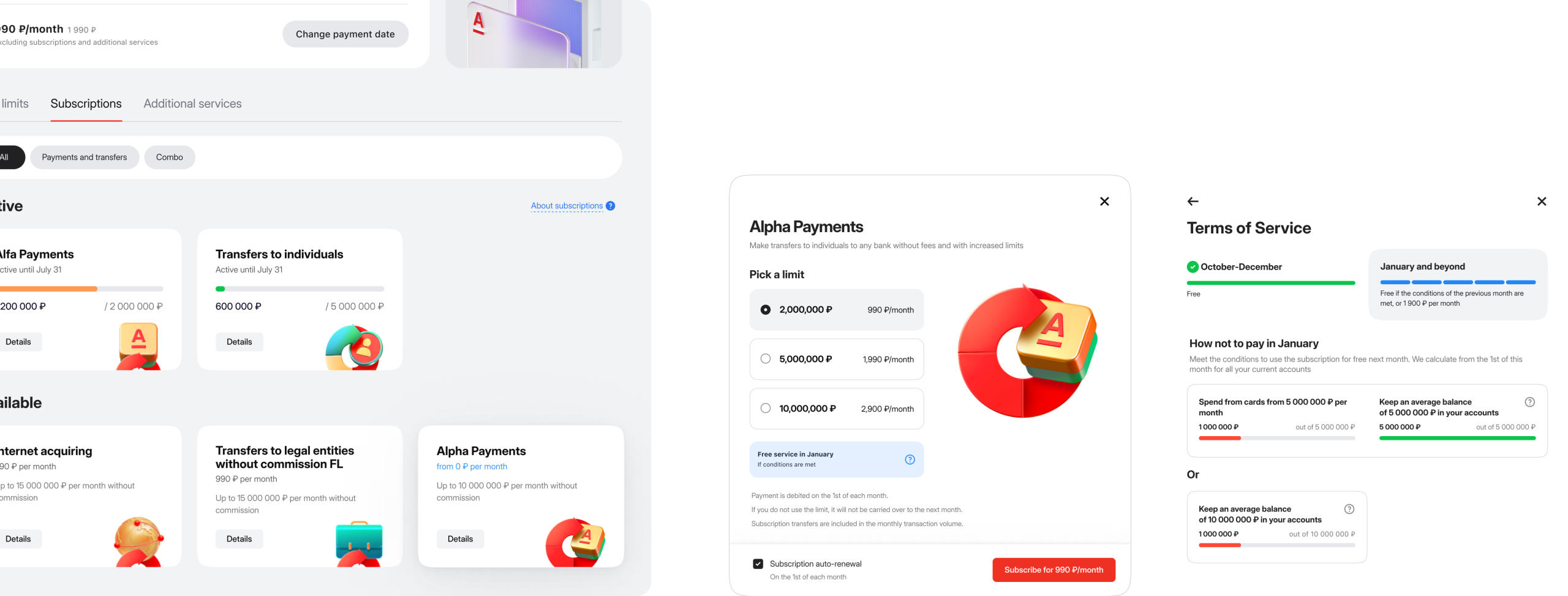
The redesigned widget made the subscription easier to evaluate at a glance. Instead of hiding value behind product names and banking conditions, it surfaced the numbers users actually needed: monthly limit, amount used, renewal date, and current status.
Custom illustrations from Marketing gave each subscription type a stronger visual anchor, helping the feature stand out in a dense banking interface. The widget stopped acting like a passive service card and became a useful entry point into the subscription experience.
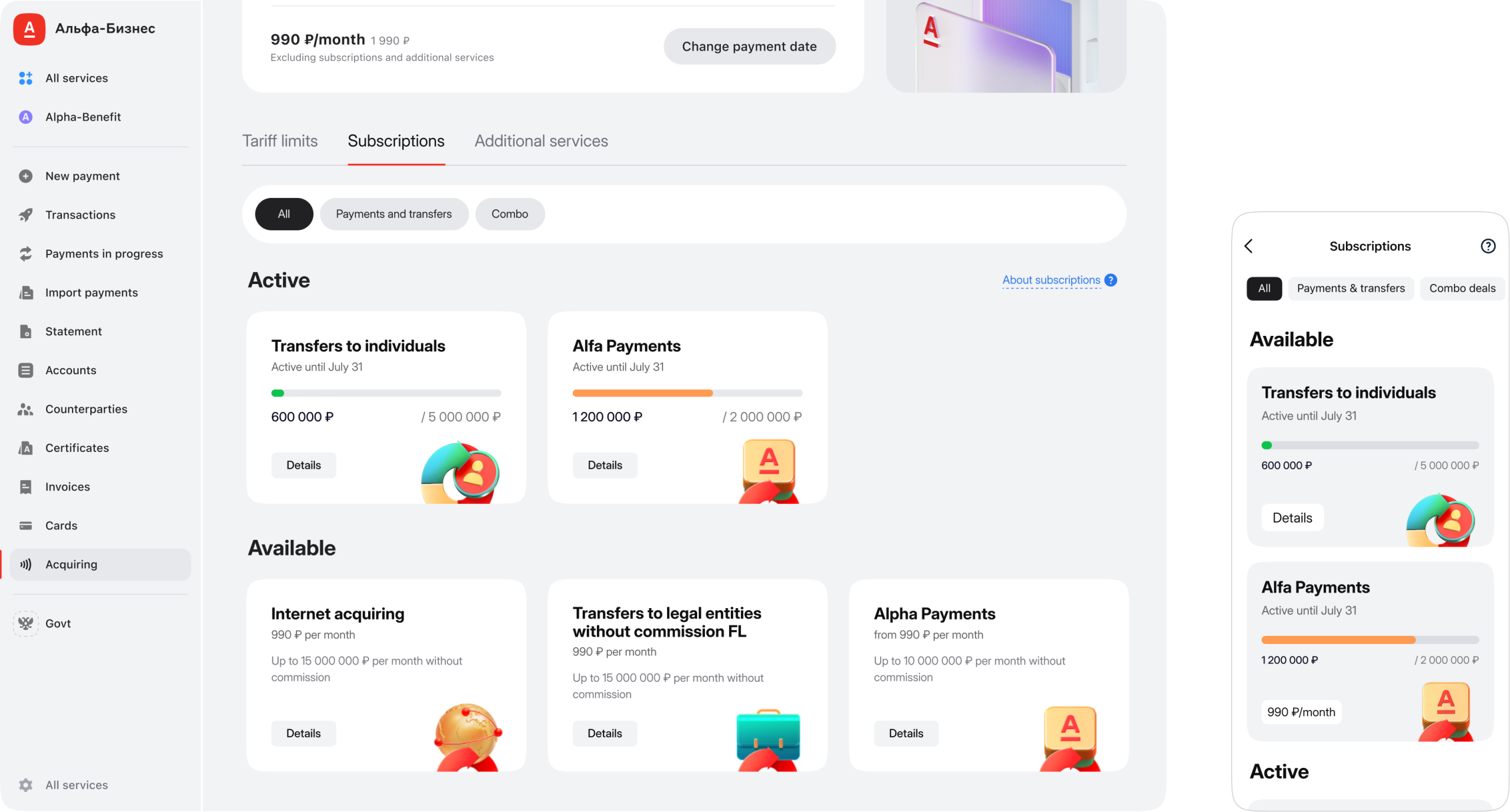
The redesigned card showed what was active, what had been used, and what came next without forcing users to open support or decode banking terms.
One Offer,
Clearer Choice
The old modal repeated the same subscription across multiple options, each with a different number. It made the offer look fragmented and harder to compare than it needed to be. I consolidated the experience into one clear card with a simple amount selector.
Customers could understand the proposition first, then adjust the value. The illustration changed with the selected amount, giving the choice a visible response without adding more UI complexity.
The offer now lived in one place: easier to compare, easier to adjust, and easier to activate.
Closing the Loop
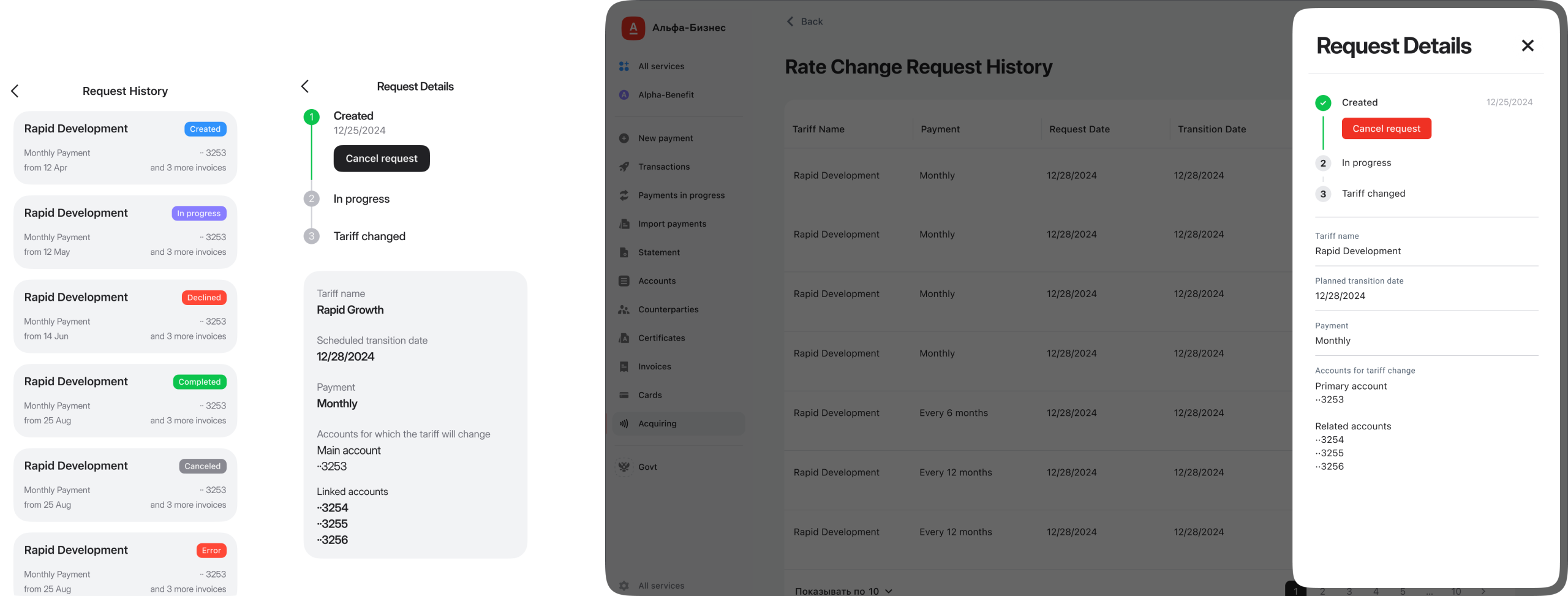
Support questions also showed two recurring needs: customers wanted to review tariff history and understand how to earn free subscription periods. We added both.
Tariff history became a usable timeline where customers could review requests and cancel changes when needed.
For subscriptions, we added a simple incentive mechanic: meet the target, and the next month is free. That turned the product from a static paid service into something customers could track, manage, and work toward.
Outcome
Subscription sign-ups grew by 156%. Support questions fell by 25%. The redesigned experience made the product easier to find, understand, and activate — without rebuilding the whole banking app. We shipped in 10 weeks by focusing on the highest-leverage parts of the flow: discovery, value communication, activation, and post-activation clarity.
The project confirmed a simple product lesson: useful features still need a clear path to value. If users cannot see what a product does, why it matters, and what happens next, they will either ignore it or ask support.
Why it worked
We learned that great features don't need rebuilding, they just need to be seen. Our job was to help something wonderful step into the spotlight.
Is your best feature hiding?
If your product has a great solution that users can't find, I can help bring it into focus. Let's talk.