
Ongoing
Budu Corporate
Redesign
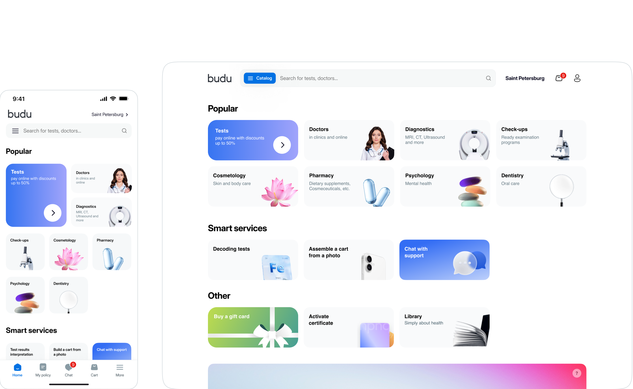
Budu connected patients to hundreds of
clinics, but its interface connected to nothing.
The product had built a marketplace in its
infrastructure, yet delivered a scattered
directory in itsexperience.
We redesigned it to make comparison clear,
which cut cart abandonment by 35%, boosted
conversions by 20%, and sped up bookings
by 25%.
Industry
Medtech
Role
Design Director

What It Does
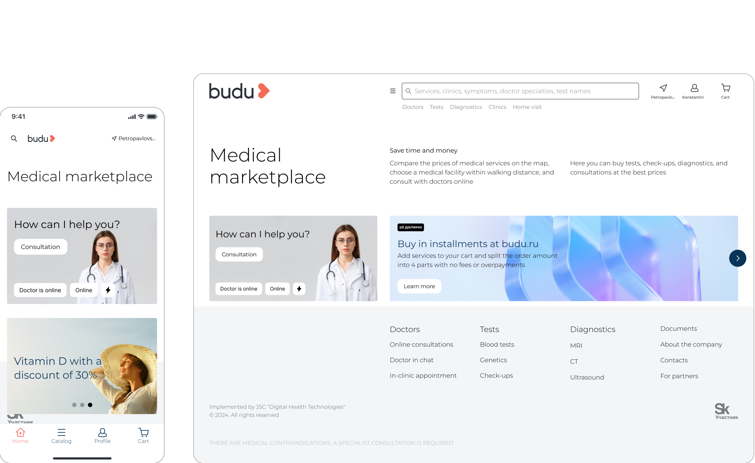
Budu is a medical marketplace that connects patients with hundreds of clinics for services like tests, check-ups, and vaccinations. Its core feature integrates with clinic chains to allow price comparison and appointment booking.
Problems
Hidden Marketplace: The UI did not communicate its core function, failing to facilitate comparison.
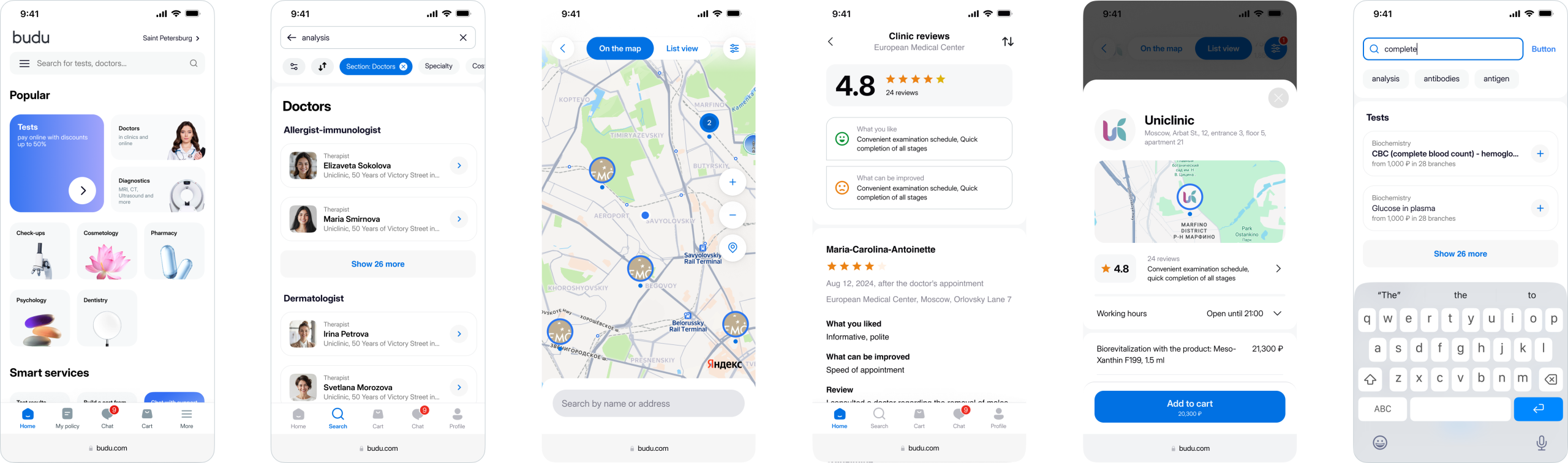
Ineffective Discovery: A broken search that failed on simple queries and a complete lack of filters in the results screen made finding the right service a chore, not a starting point.
Technical Debt: Early "ship fast" decisions created a brittle UI that hindered growth and iteration.
Actions
Led the strategic redesign of the core user experience, fundamentally redesigning the entire service across key pages to instill a "marketplace feel." Introduced visual patterns for easy comparison and trust signals, and built a reusable component system to replace fragile UI debt.
Results
Achieved a 35% decrease in cart abandonment.
Increased conversion on key service pages by 20%.
Made the booking flow 25% faster.
Established a scalable design foundation for future product growth.

This was more than a cosmetic issue; it was a fundamental mismatch between model and interface. The "ship fast" development approach, which initially enabled growth, had backfired. It resulted in a brittle, inconsistent UI ecosystem that made every new feature a tactical patch rather than a strategic step.
The cost was clear: abandoned carts, low conversion, and user sessions that ended in frustration rather than a booked appointment.
The solution was ready. It just never made it to the problem.
The Core Insight
The platform failed at its most basic promises. It presented information, but never
the right information to make a decision. The insight was a simple reversal - we were designing the connective tissue: the search that finds services, the service page that shows where to get it, and the clinic page that proves it can help.
The Search That Returned Everything
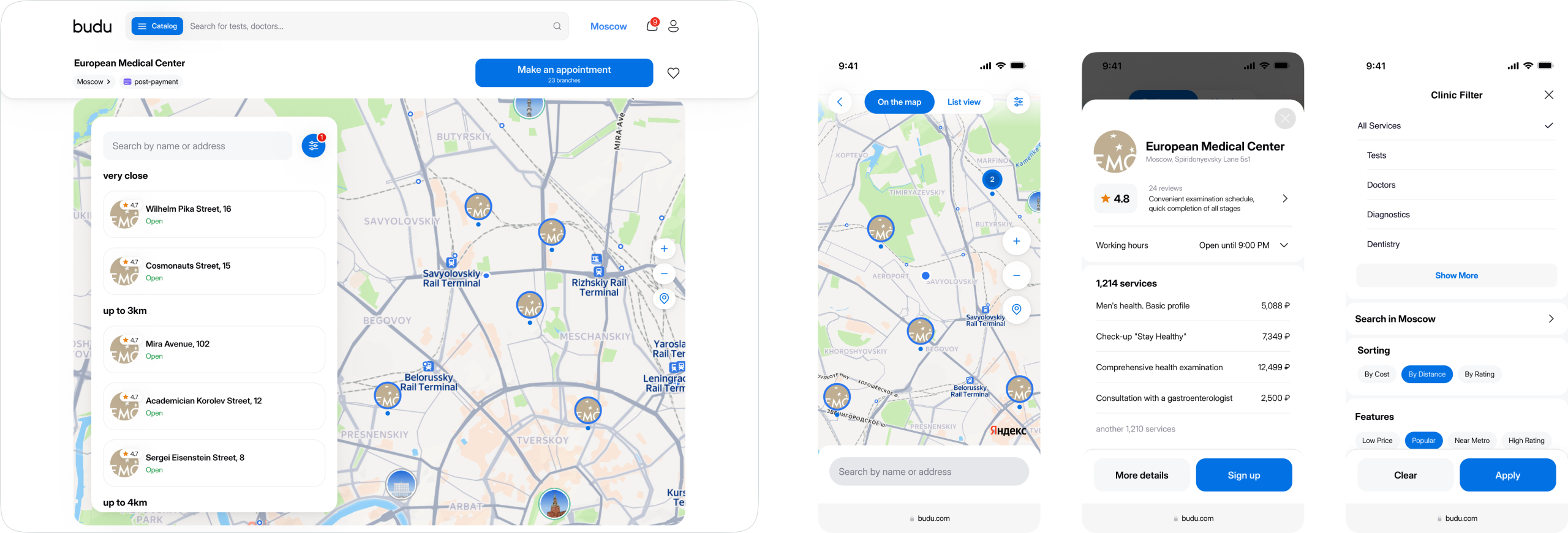
The search was a blunt instrument. A query for "MRI" would return a jumbled list where actual services, outdated blog posts, and clinic names all competed for attention. Finding what you needed meant sifting through digital noise.
The Service Page That Described a Ghost
A page for a "full body check-up" would describe the service in detail but offer no way to actually get it. There was no list of clinics that provided it, no map to see locations, and no supplementary "often booked with" services to consider.
The Clinic Page That Hid Its Own Offering
A clinic's page would list its address but little else. There was no map to find its subsidiaries, no directory of its specialists to search, and crucially, no clear list of the services it actually provided.
Making Comparison
Inevitable
Our mission was to design the marketplace experience that already existed in promise. We focused on four key pages (Main, Service, Clinic, Doctor) and rewrote their grammar.
We replaced isolated information silos with a unified, comparative canvas. Service pages became comparison hubs, with clinics presented as comparable cards featuring price, availability, and ratings in a single scan.
We built a marketplace where every screen leads to a decision.
Clarity as a Filter
We redesigned the search to stop being a vocabulary test. Now, results appear as a clear, actionable grid where the most relevant action isn't to click, but to to add to cart.
The search stopped being a gate and started being the first shelf in the market.
Finally, the search results looked less like a library catalog and more like a storefront. We shifted the user's first thought from "Is it here?" to "Which one do I want?

The first shelf in the market. Search results are now a selection to build from, where the most logical next click is to start your shortlist.
From Directory to Arena
We turned service pages into comparison engines. Clinics became comparable cards, having a price, slots, and ratings at a single glance.
We gave the service page a new job: to host the conversation between the user and their options.
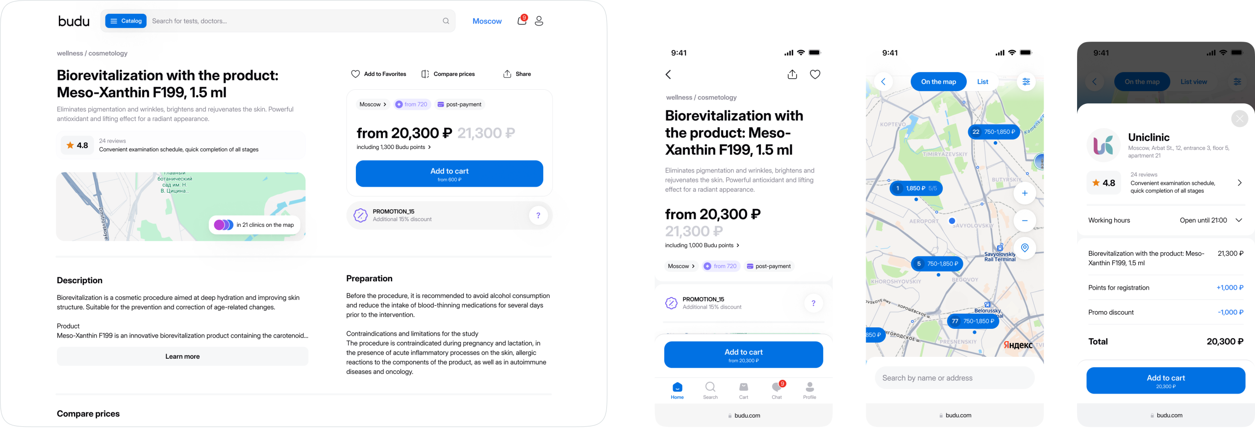
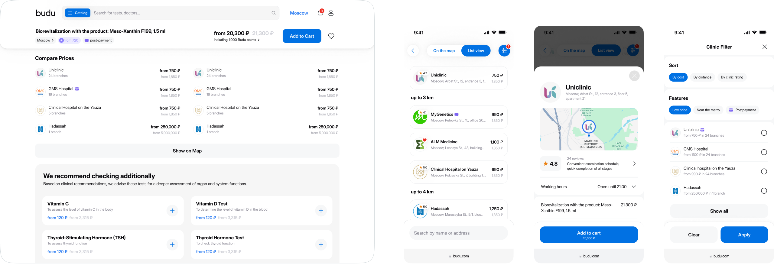
Where the directory became an arena. Every service page is now a comparison matrix, transforming a question into a set of clear, actionable answers side-by-side.
The Clinic That
Introduced Itself
We redesigned the clinic page to answer the only question that matters: "Can you help me, and how?" We integrated maps for its locations, listed its key services with direct booking links, and showcased its specialists. It became a transparent profile, not a hidden brochure.
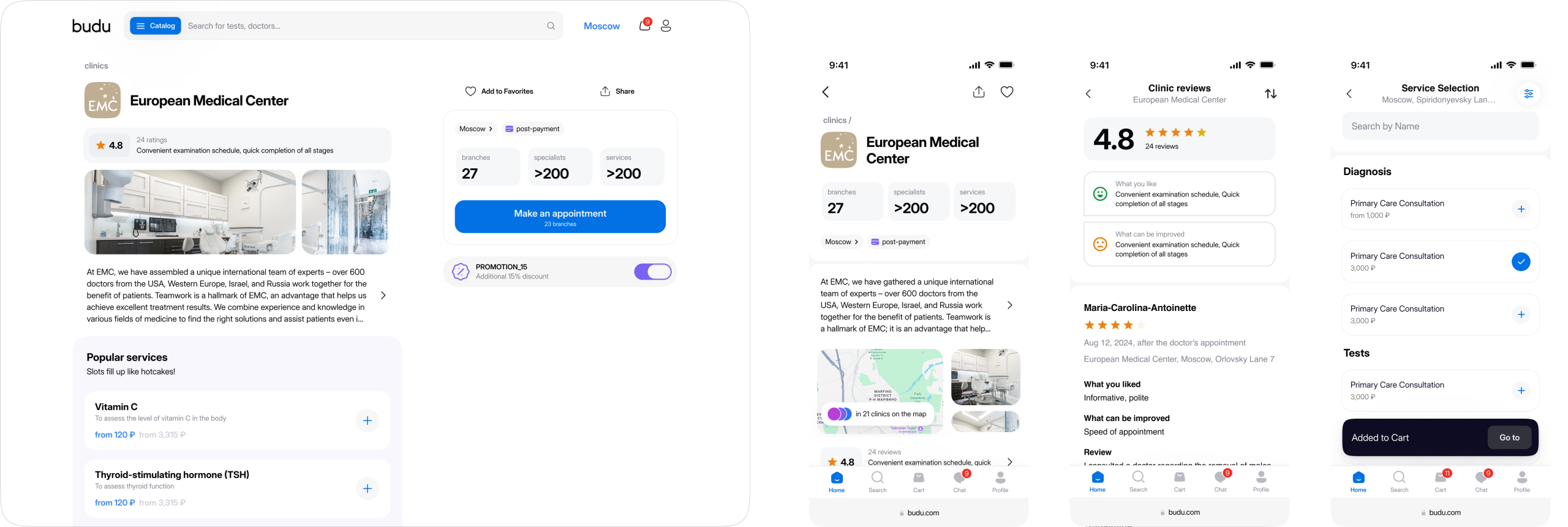
We redesigned the clinic page so it stops introducing itself and starts making appointments.
Filters That Spoke Up
There were no filters. The interface offered a world of choice but no way to navigate it. We built them in from the ground up and gave them a permanent, prominent stage. Since the whole point is choice, we baked filtering for price, location, and rating into the spine of every results page.

The platform had offered a world of options but no way to ask for what you wanted. We gave it a vocabulary. Now, the filters sit at the head of the table, translating preference into possibility.
The Chat That Acts
Every marketplace has a secret: most people don't know what to search for. They arrive with a problem, not a product SKU. Our job was to accept the problem as the query.
So we built a chat that reads between the lines. A user sends a photo of a lab slip or types “my lower back has given up.” and AI looks for the job to be done. It cross-references the intent against our entire network of services, specialists, and clinics, then curates a cart with surgical precision.
It is search, redesigned from the inside out. Instead of requiring the user to translate their need into our catalogue’s language, the catalogue learns to translate itself into theirs.
The most complex journey, from symptom to booked appointment, now happens in a single conversation.

The help desk became the booking desk.
The Victory Lap
The interface finally accepted its job. When the platform stopped asking users to connect the dots and started drawing the lines for them, the metrics followed the logic. Cart abandonment fell by 35%, the clearest sign that confusion had been replaced by clarity.
Conversions grew by 20% on service pages, proving that presenting a choice is more effective than presenting information. And because we built the decision into the page, the booking flow happened 25% faster.
The Final Thought
A marketplace succeeds not when it has options, but when it makes a choice feel obvious. Our work was to design the moment of clarity, the point where comparing stops and deciding begins.
Ready to design decisions?
If presenting options isn't enough, I can build the framework that makes one choice stand out. Let's talk.