
2025
Alfa Bank
Subscriptions
At Alfa-Bank, Russia's largest private bank, we
had a subscription feature that was perfectly
useful and perfectly hidden. Сustomers kept
hitting transaction limits while the solution sat
have been waiting to be discovered.
We brought it into focus. The result:
a 156% increase in sign-ups and a 25% drop
in support questions in 10 weeks.
Industry
Banking
Role
Principal Designer

What It Does
A self-service portal for business clients to manage banking feature subscriptions and increase transaction limits.
Problems
Low Discoverability: Adoption was 30% below target.
Poor Value Communication: UI showed names, not benefits.
Operational Drag: High volume of preventable support tickets.
Actions
Diagnosed UX failures via research, redesigned the hub into a clear "value dashboard," and implemented a new component system for rapid engineering execution.
Results
Sign-ups grew by 156%.
VOC increased from 3.7 to 4.8.
Support tickets fell by 25%.
Shipped in 10 weeks.

Alfa Bank had a subscription feature that business customers genuinely needed. There was just one tiny problem: it was the best kept secret in our app. Customers kept hitting transaction limits while our solution sat quietly in the corner, waiting to be discovered.
The numbers told the story: adoption was 30% below projections, support received over 200 monthly tickets about limits, and internal data showed thousands of failed upsell attempts where users hit a paywall but didn't convert. Yet the real plot twist? Everyone who actually used subscriptions loved them. We hadn't built a bad feature, we'd built an invisible one.
The solution was ready. It just never made it to the problem.
The Visible
and the Vague
We had built a room nobody could find the door to. The subscription feature was technically live, but practically invisible, buried beneath layers of interface indecision and competing priorities.
The Sea of Sameness
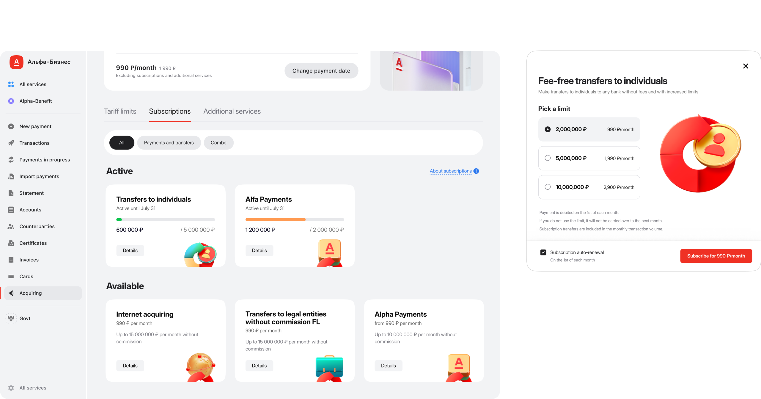
A subscription widgets itself showed a name, a description, and a button. It didn't tell you how much money was left, when it expires, or when it renewes. The only indicator of an active subscription was a small green tag, forcing users to hunt for a speck of color in a list of dozens of alphabetically sorted, identical widgets.
Every widget looked exactly the same: a sea of identical cards where nothing stood out. The widgets existed, but no one had cared to make them useful.
The Timeline Paradox
We had three months to solve a problem that required rethinking fundamental navigation. This forced our first major trade-off: depth over breadth. We could not redesign everything. We had to choose what to perfect and what to leave for later.
We Gave Numbers
a Voice
We turned our wallflower into the life of the party. The subscription widget learned three new languages: value, time, and progress. It now speaks in clear numbers:
the monthly limit, the amount spent, the next renewal date. It answers the questions that otherwise would have gone unasked.
And with the custom illustrations from Marketing, each subscription type gained a visual anchor. The feature became noticeable, useful, and impossible to ignore. It went from being a tool people owned to one they actually used.

A widget that used to whisper now speaks in full sentences. It tells you what you have, what you've used, and what's next, no translation required.
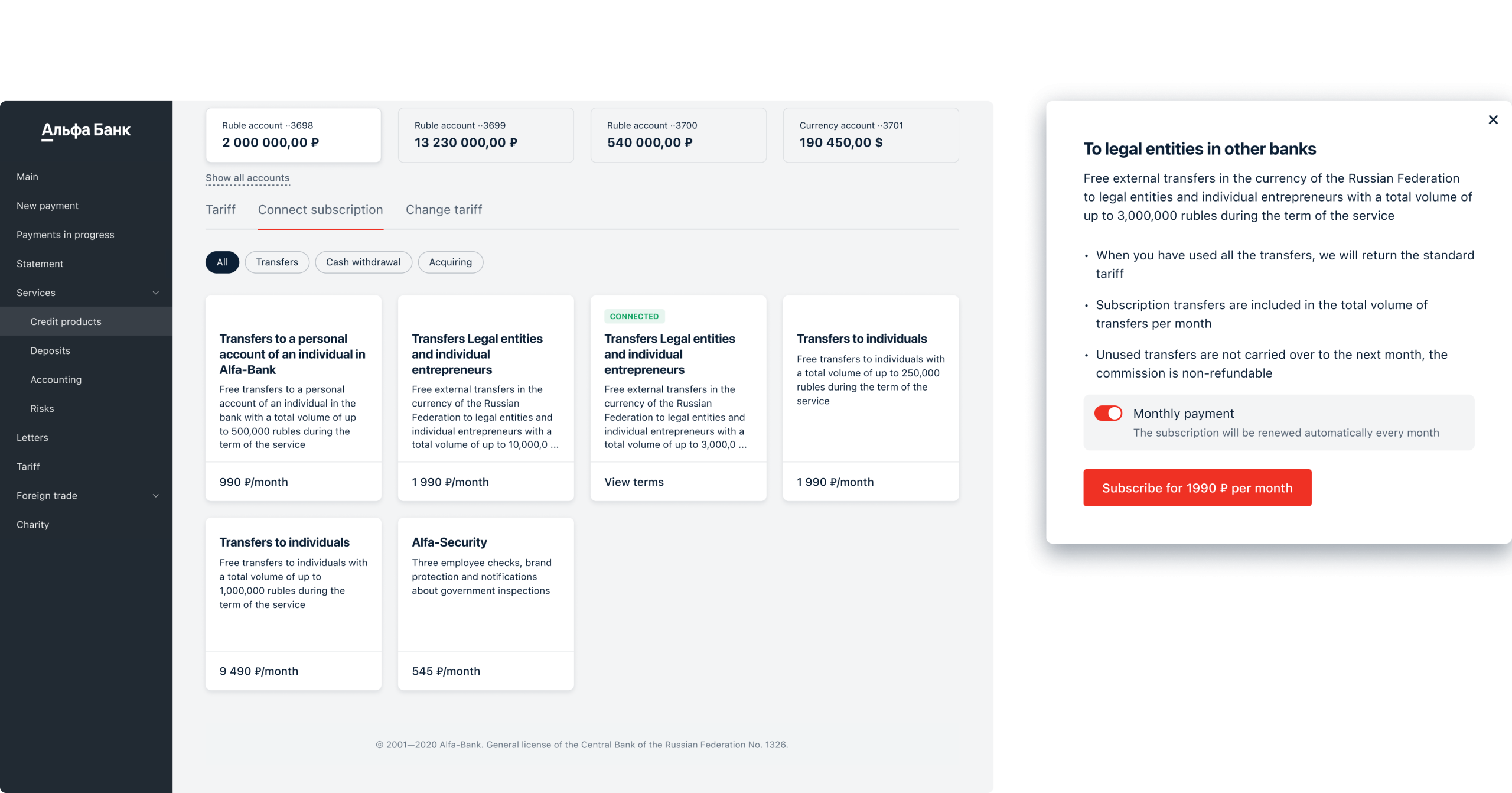
The Modal
That Learned to Count
The subscription modal had fallen into a strange habit: it kept introducing itself. The same subscription would appear again and again, each time with a slightly different number, cluttering the screen with its own variations.
We gave it a single home.
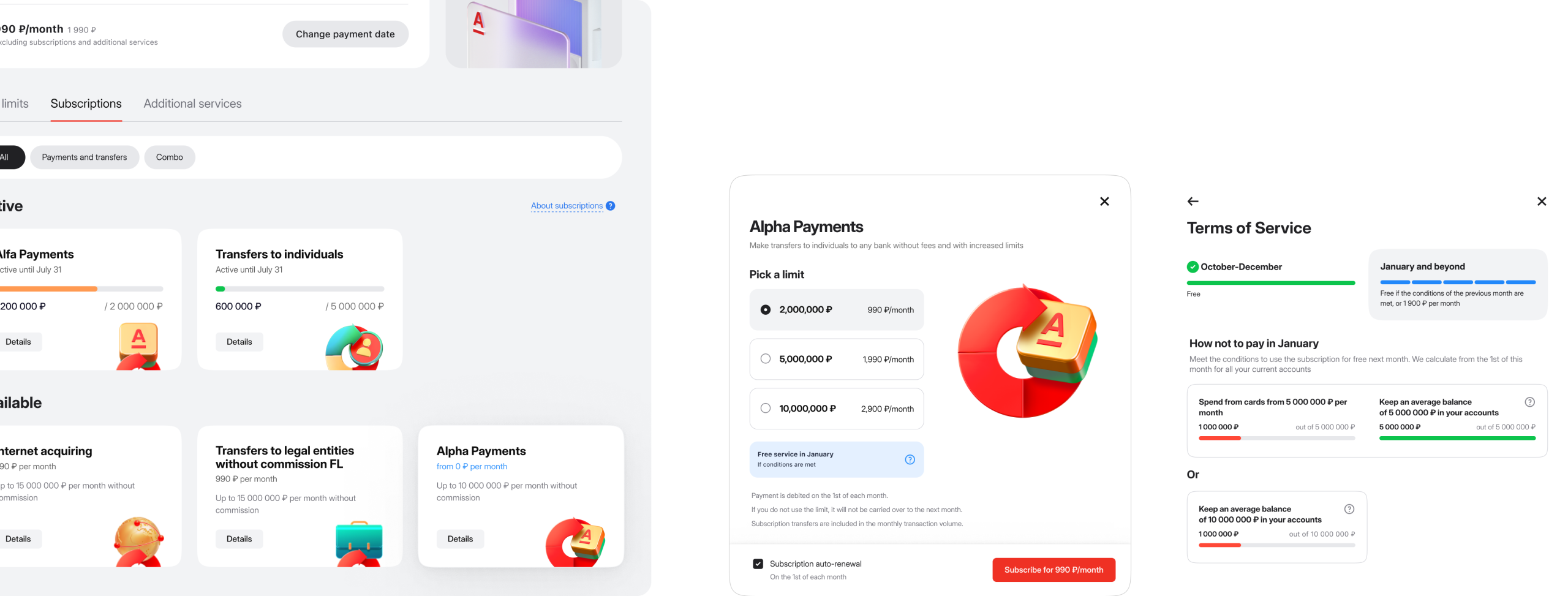
Now, one elegant card holds the entire proposition, and a simple selector lets customers choose their amount.
The illustration subtly shifts its appearance to match the choice, a visual nod to the decision being made.
We ended the subscription's identity crisis. It now lives in one place, and its illustration learns to reflect your selection.
The Encore Features
While the subscription redesign was our headline act, these supporting features set the stage for a better experience.
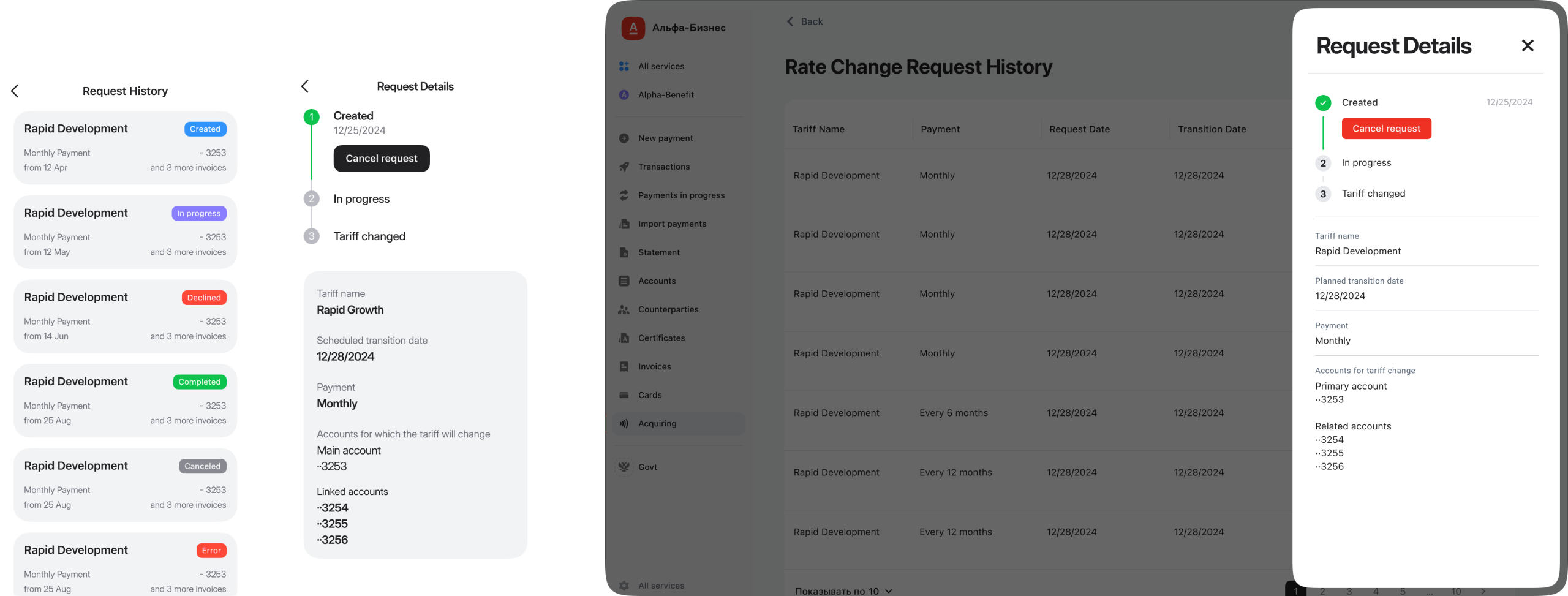
Customers kept asking for two things: to see their tariff history, and a way to earn free subscriptions. So we built both.
The tariff history became a timeline you can actually use, review any request and cancel it if you change your mind. No more being locked into decisions.
And for Subscriptions, we added a simple rule: hit your targets, and the month is on us. It turns a cost into an achievement.
The Victory Lap
Subscription sign-ups grew by 156%. People tend to use the tools they can see. Support questions fell by a quarter. The interface had learned to speak for itself. We shipped in ten weeks. And we discovered that the most elegant solution is often the one you can actually finish.
A good solution delivered today is more valuable than a perfect one planned for tomorrow. Testing early showed us what our late assumptions had overlooked. We learned that if you want users to take action, you must place the path directly before them.
We also confirmed that technical schedules operate on their own calendar. Perhaps most importantly, we saw that alignment across teams isn't just beneficial, it's fundamental to the product itself.
The Next Chapter
We're bringing in the visual flair we originally planned, adding smart suggestions that anticipate needs, and making subscriptions feel less like an add-on and more like the main event.
We learned that great features don't need rebuilding, they just need to be seen. Our job was to help something wonderful step into the spotlight.
Is your best feature hiding?
If your product has a great solution that users can't find, I can help bring it into focus. Let's talk.