
2023
Tabby Advance
Personal Loans
Tabby had a fast, simple BNPL experience. Adding personal loans introduced a heavier financial product with longer terms and higher user commitment. I redesigned the experience around clarity, progressive disclosure, and plain-language decision support.
The result: a 40% increase in loan adoption and a 30% drop in related support queries, proving you can add power without adding weight.
Industry
Fintech
Role
Finance Design Lead
Focus
Loan Activation, Fintech UX, Progressive Disclosure
Business problem
Tabby needed to add a more complex financial product without breaking the speed and simplicity users already trusted.
Design response
Tabby needed to add a more complex financial product without breaking the speed and simplicity users already trusted.
Business result
The redesign improved loan completion and reduced support questions while keeping the product experience lightweight.
67%
Organic Discovery
25%
Higher Completion
30%
Fewer Support Tickets

Tabby’s core product was built around fast, lightweight payment decisions. Personal loans changed the equation. A loan required more explanation, more legal disclosure, and a higher level of user commitment. The challenge was to make that complexity understandable without making the product feel slow or heavy.
Designing Trust
Into the Flow
BNPL decisions happen quickly. Loans require more trust. The interface had to explain a longer financial commitment without turning the flow into a compliance document. Legal needed clear disclosures, Product needed speed, and users needed to understand what made this different from a standard Tabby plan.
Separating Loan and BNPL Mental Models
Loans could not reuse the same mental model as short-term BNPL plans. Users needed clearer signals around duration, total cost, repayment schedule, and commitment.
Progressive Disclosure
for Financial Terms
We structured the flow so users saw the most important information first, then could expand into terms, schedules, and cost details when they needed them.
Keeping the Product Lightweight
The loan experience had to feel native to Tabby, not like a bank form dropped into a BNPL app.
Designing
the Loan Decision Path
We started by mapping the BNPL and loan journeys side by side. That made the split clear: some patterns could stay familiar, but the loan path needed its own decision structure.
Users had to understand eligibility, amount, term, total cost, and repayment before committing. The design goal was not to shorten the flow at any cost. It was to make each step earn its place.
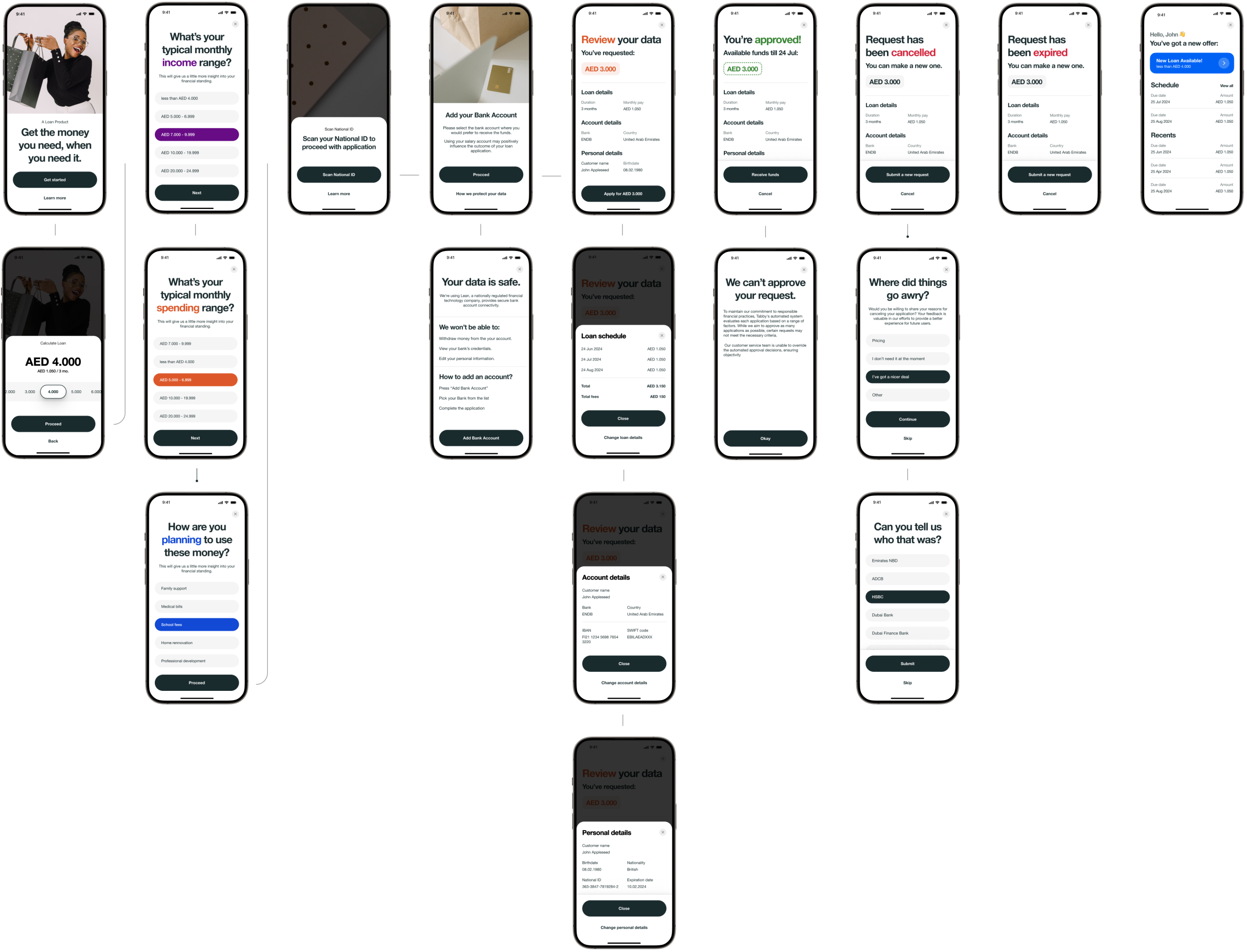
Mapping both journeys showed where familiarity helped and where loans needed clearer explanation.
Progressive Disclosure
Without Hiding the Terms
We did not hide complexity, we sequenced it. The flow showed the decision-critical details first: amount, term, repayment, and total cost. Deeper explanations were available when users needed them, so the experience stayed fast without becoming vague.I
Plain Language
for Loan Decisions
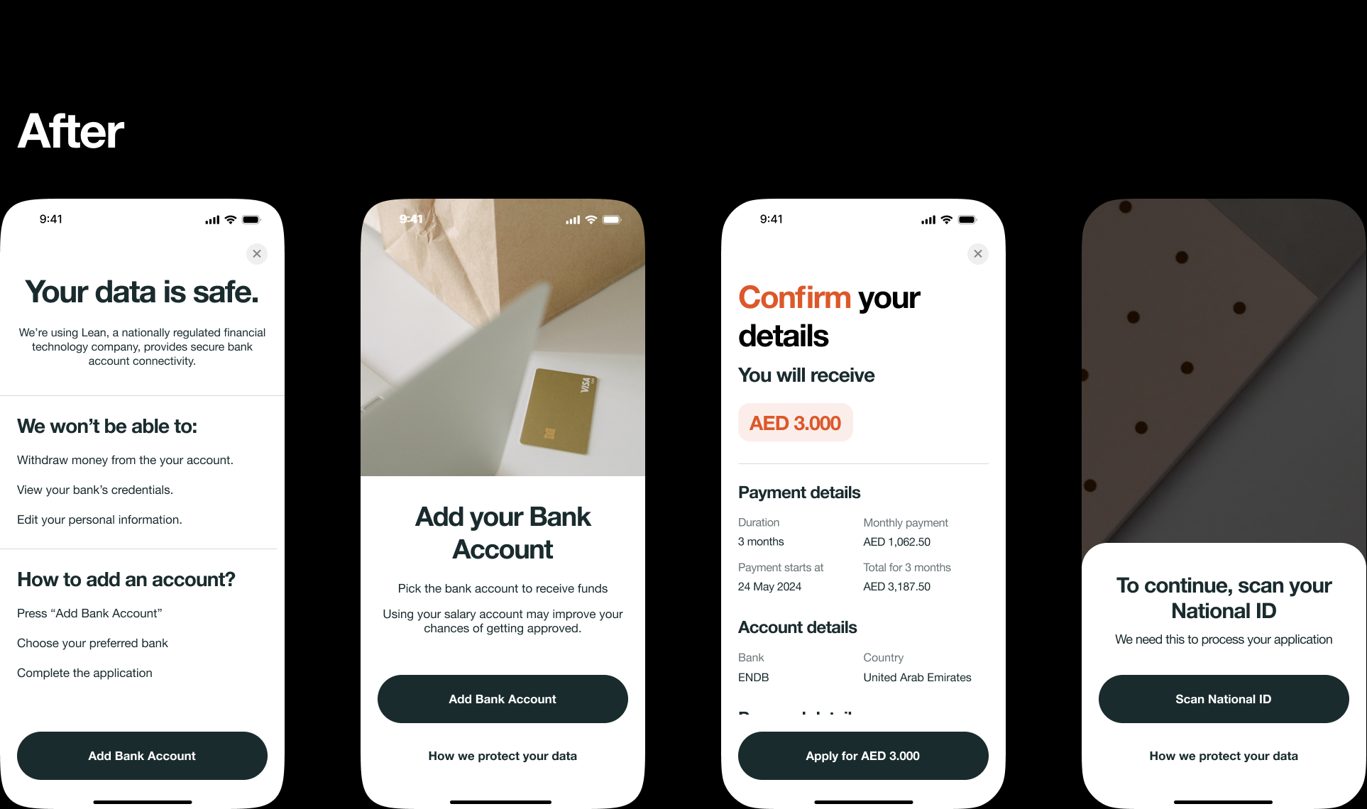
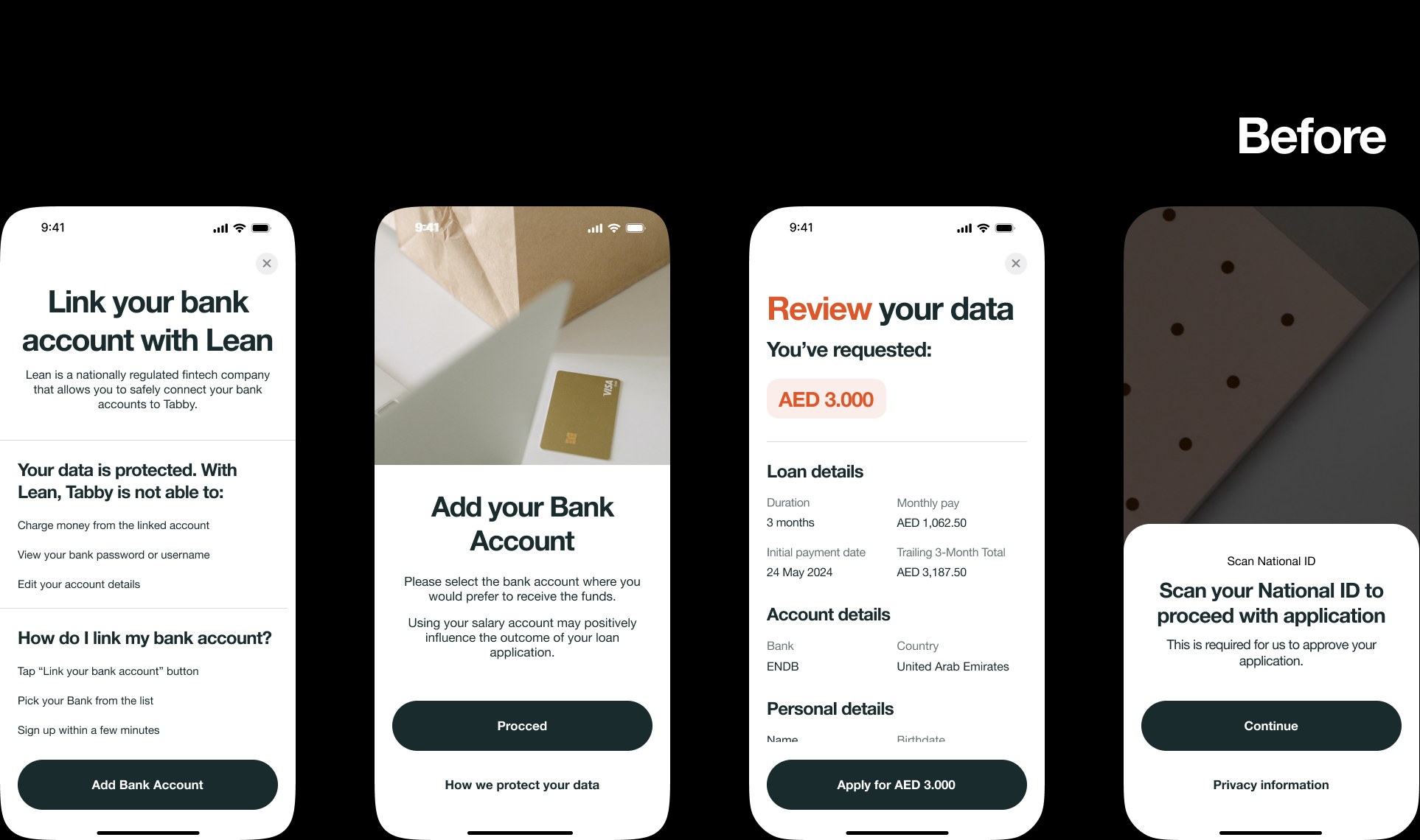
User testing showed that wording mattered as much as layout. We replaced finance-heavy labels with language users could act on.
Instead of making people decode terms, the interface explained why each detail mattered to the decision. Clear terms made the product easier to trust.
Making Compliance
Feel Intentional
Some compliance steps were mandatory. The design challenge was to make them feel expected, not disruptive. We prepared users before the legal gate appeared, explained why the step was needed, and kept the interaction rhythm consistent with the rest of the flow.
The result was a regulated loan journey that still felt like Tabby: clear, fast, and predictable.
We learned where the experience dragged. We saw the moments of hesitation, the points of confusion. Then we smoothed them over. The slow money became smart money.
Outcome
Loan completion increased by 25%, while support tickets dropped by 30%. Organic discovery reached 67%, showing the product could be found and understood without heavy promotion. NPS stayed within ±2 points, which mattered as much as the conversion lift.
The redesign added a more complex financial product without damaging the simplicity users expected from Tabby.
What This Unlocked
The loan redesign gave Tabby a reusable way to introduce heavier financial products into a lightweight app. Instead of treating complexity as a separate experience, the product could now support deeper services through clear decision paths, plain language, and progressive disclosure.
Adding weight without burden?
If you're introducing power into a simple product, I know how to make it feel effortless. Let's talk.